
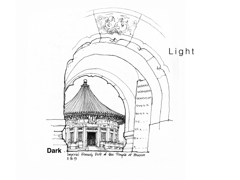
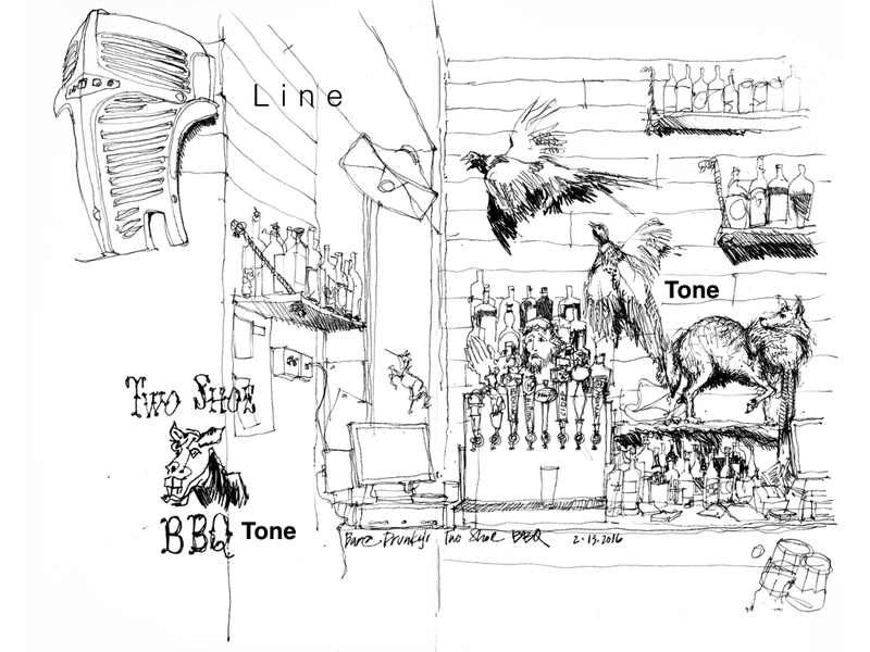
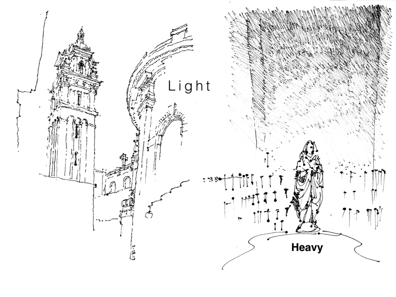
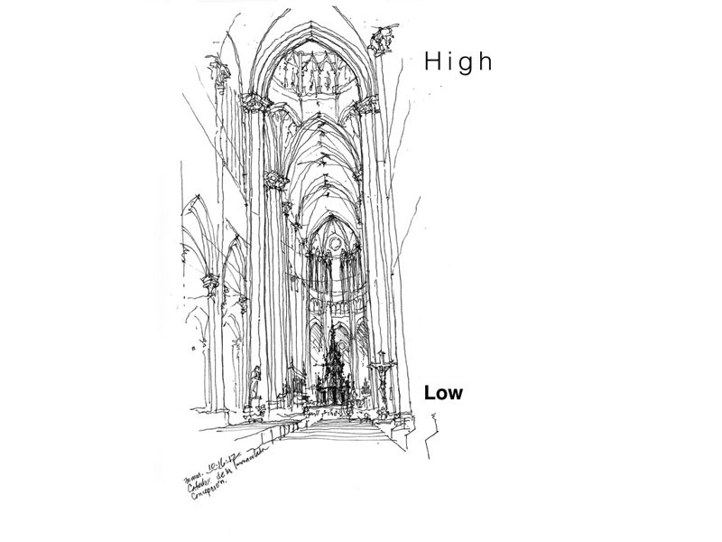
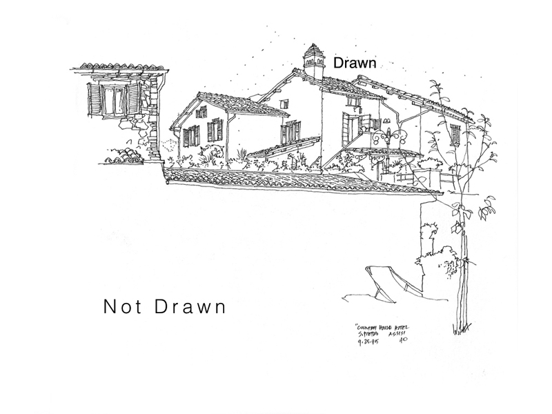
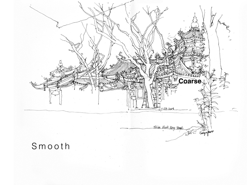
Back in 2012, I had posted a few examples of how I used contrasting tonal values to define form and draw attention to a particular area in a sketch. In this post, I want to expand on the idea of contrast—the discernible distinctions in line weight, tonal values, textures, details, and even relative position on a page—that is essential to avoiding blandness and giving life to a drawing. Here are examples of the different kinds of contrast at our disposal. Note how the visual tension between the two contrasting elements or areas contribute to the composition of a drawing.
Pingback: 10 things I learnt from Ching – mofussilthoughts