The Red Door

After a brief hiatus, I am continuing my series of views of the Fremont neighborhood of Seattle. At the northwest corner of Evanston Avenue North and North 34th Street sits the Red Door Ale House atop a concrete parking garage. How did it get here?

RedDoor

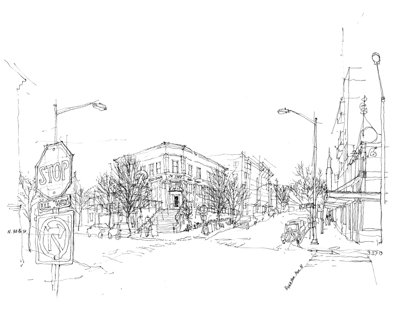
The original structure was erected on the Fremont tide flats in 1900, before the Lake Washington Ship Canal was constructed. Three years later, it was moved to the northeast corner of Fremont Avenue North and North 34th Street. In 1917, the structure was raised up on stilts so that it would be level with the newly raised streets surrounding it, where it became a familiar sight as one drove across the Fremont Bridge. Originally a drugstore, it was transformed into a tavern in 1938. It is said that the original uneven floor was a sort of sobriety test for those who might have imbibed a little too much ale.

In 2001, to make room for a new mixed use development, the Red Door was relocated to its current location, which you can see in the view above. To the right is the local PCC Natural Market and in the background beyond you can see the Fremont Rocket.

Emerald City Trapeze Arts

ECTA2

Housed in an old boiler works factory in the Sodo district of Seattle, the Emerald City Trapeze Arts is a school for aspiring flying trapeze and aerial artists. The people at ECTA were nice enough to welcome the Seattle UrbanSketchers group yesterday to observe one of their classes and sketch the proceedings.

ECTA1

If you think drawing people is difficult, it is even more challenging trying to capture them in motion as they swing and twirl through the air thirty or forty feet above the floor. There are ample safety belts and netting for the students, but these elements made sketching the scene that much more challenging. So my approach was to begin with the structure of the old timber frame building and then merely suggest the movement of the students. You might be able to see the light strokes I used to try to capture that movement. My good friend, Frank B., helps to establish the foreground, where I was, overlooking the tall space.

Vignettes

Trafalgar

Some sketchers start by drawing a border and then filling in the frame. I prefer not to restrict my images to fit within a predetermined frame; my only size constraint is the page or two-page spread on which I’m drawing. And even then, I try to leave myself room for the drawing to develop and grow if necessary. For this reason, I tend to draw vignettes, images that fade into the background without a definite border.

Structure

You can see here how I typically start a drawing by roughly outlining the basic forms and establishing a skeletal structure upon which I can elaborate. Then, depending on how much time I have, I select what I want to focus on and develop those details, textures, and values. This approach allows me to leave parts of a drawing unfinished if pressed for time, especially when drawing on location.

SanMarco

Here is another example of how I’ve left portions of a drawing unfinished, allowing the viewer to fill in or sense the missing parts without those parts being actually drawn. Unfinished drawings, in fact, can often engage viewers by exercising their visual imagination.


Chinese Calligraphy

Wanting to produce more drawings for the paper sheets illuminated in the Ingo Maurer-designed Zettel’z 5 Chandelier, I thought of adding Chinese characters that held some meaning to me and my family. Here are some of my initial experiments.

ChineseCharacters1

Despite my Chinese heritage, I do not speak, read or write Chinese. And I realize that trying to write in a language I cannot read nor comprehend can be dangerous, for a subtle change in a stroke here and a misplacement there could alter the meaning of a character, and possibly not in a good way.

ChineseCharacters2

Also, being left-handed, I cannot possess the natural inclinations of a right-handed calligrapher. Yet I admire Chinese calligraphy for its cultural significance and its visual beauty. I just hope I didn’t mangle the characters too much. After trying these, I realize Chinese calligraphy is an art form that cannot be learned quickly; it requires patience, practice, and a true understanding of the culture that nurtured it. All I can do is try to mimic the graphic qualities that I admire so much.

The Rule of Thirds

Balance

Back in January, I posted a piece on maintaining a delicate balance between a static state and one of dynamic disarray when composing a scene and laying it out on a page. Thinking about this subject again brought to mind the rule-of-thirds, a principle of composition that has been used for centuries by painters, photographers, and other artists.

RuleofThirds

We can visualize this principle by dividing our canvas or page into nine equal parts with two horizontal and two vertical lines spaced equally apart.

Thirds1

Thirds2

The rule-of-thirds postulates that we should place points of interest at any of the four points of intersection or lay out important compositional elements along these lines. Applying the rule-of-thirds in these ways is supposed to create visual tension and an image that is more dynamic than one with the subject matter simply centered on the page.

Horizon

Consider how moving the horizon line in these three compositions can affect how we perceive the same subject matter in subtle ways.

Thirds3

Of course, rules are alway subject to being broken but experimenting with the rule-of-thirds is a good first step before deciding to disregard it. Even when applying the rule-of-thirds, we should remember that it is not an exact rule to be applied in a precise manner. It merely serves as a guide.

SymmetricalAsymmetrical


The first decision we have to make is whether a composition is to be balanced in a symmetrical or asymmetrical manner. If the latter, then the rule-of-thirds can serve us well.

Understanding Geometry

I’m sure not everyone would share my love for geometry but an appreciation of the subject has served me well in my years as an architect. Understanding geometry, especially spatial relationships in three dimensions, makes it easier to draw these correspondences in real life.

Geometry

Take this interior view of St. James Cathedral. Because of the ornamentation, textures and color, it is easy to get confused when confronted by the richness of the scene. But underlying all of the lavish decorative features is a clear geometric scheme.

Geometry2

Imagine looking from above at the square crossing where the nave of the church intersects the transepts. From each side of the square crossing rises semicircular arches. From the apex of each arch, we can extend lines until they intersect at the center of the dome’s oculus. The diagonal groin lines that mark the intersection of the two vaults rise from each corner to intersect at the same center.

Geometry3

If we understand these geometric relationships and, just as important, we can see them as we sit in one of the pews looking upward at the dome, we can draw the square crossing and estimate the placement of the oculus without guessing. We can place it at the peak of the dome, at the intersection of the crossing groin ribs, directly above the center of the crossing.