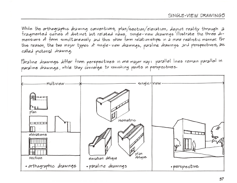
The process of handlettering and drawing camera-ready pages for my books continued throughout the 1980s. But in the early 1990s, armed with an Apple Macintosh SE, a laser printer, and digital typography, I made my first foray into using digital technology as I prepared A Visual Dictionary of Architecture.
After assembling and organizing the terms and definitions into sets, I laid the material out on oversized sheets in Aldus Pagemaker. It was fortuitous that Adobe had just recently scanned my handlettering and created the digital font, Tekton, which I used for the dictionary terms and definitions. After printing the pages out, I laid tracing paper over each page and roughed out the size and position of each illustration to fit. I would then work back and forth, adjusting the placement of text in Pagemaker as necessary to accommodate the illustrations before doing the final drawings by hand on Clearprint vellum. After having the drawings scanned, I placed the .tiff files into the Pagemaker files.
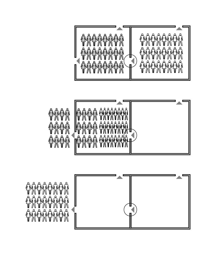
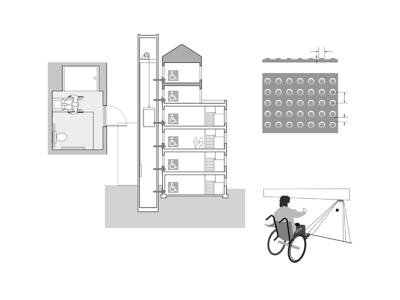
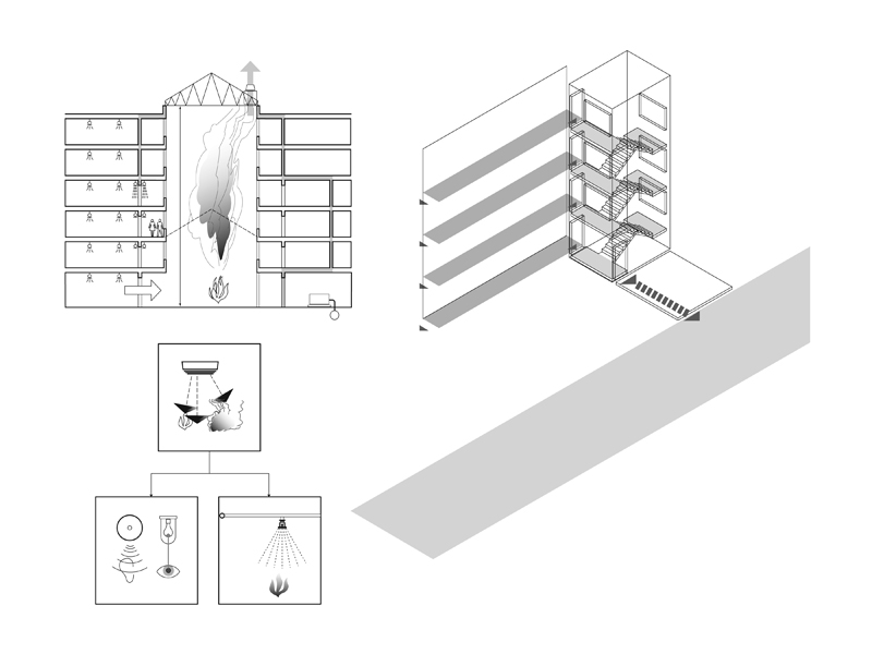
In 2000, I began working with Steve Winkel on the first edition of Building Codes Illustrated. Knowing that the International Building Code, on which the text was based, was going to be updated every three years, I decided to do all of the drawings in Adobe Illustrator, learning the program on the fly.
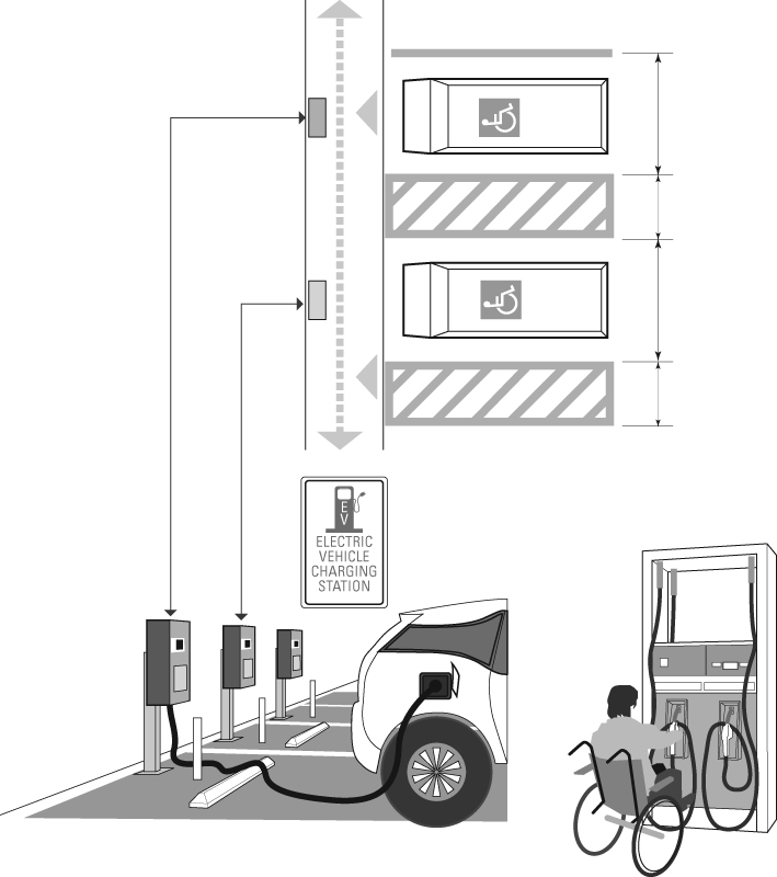
I use Illustrator basically as a drafting tool to create the visual ideas I have in mind. The many benefits of vector graphics include: using the Save As capability to try out different options; having precise control over line weights and tonal values; being able to resize drawings easily to fit a page layout; and reusing elements that I had already drawn. Most importantly, when working on a revision, instead of having to completely redo a hand drawing, I can open an existing drawing file and make the necessary changes to create the updated version.
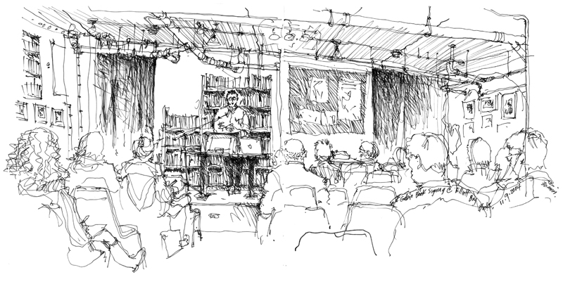
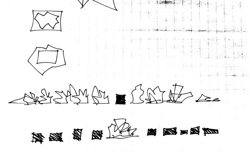
Because I am using digital tools more and more in my bookmaking, I cherish even more the opportunities to draw by hand when out on location. Even as I experiment with drawing on my iPad, the connection between eye, mind, and hand when I draw with a fountain pen in a sketchbook remains a pleasure.