Ravello and Amalfi

The few times I had the privilege of teaching in Rome, we always scheduled a field trip to the Amalfi Coast, stopping in Cuma, Naples, and Pompeii before arriving in Amalfi and using it as a base to visit Ravello and its Villas Cimbrone and Rufolo as well as the Greek site of Paestum further down the coast.

In 2000, we were able to stay in placid Ravello at the Hotel Parsifal, a former monastery built in 1288 on the edge of town. This is a view of my corner room and terrace, which overlooked the Amalfi Coast and the Tyrrhenian Sea.

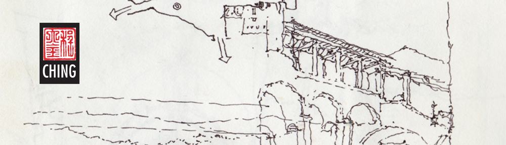
The other times we stayed at the Hotel Lidomare in the coastal town of Amalfi, just off the main piazza from which one sees this view of the Duomo. A broad stairway leads up to a striped marble and stone entrance arcade, surmounted by a pedimented facade with a mosaic tympanum. Off to the left is a Romanesque bell tower and tiled cupola typical of the area. I simply outlined the foreground and surrounding structures to contrast with the ornamentation of the cathedral.

While the drawing appears to be very detailed, this enlarged portion shows that drawing has the unique ability to suggest without having to exactly reproduce what a photograph might capture. As I wrote a few months ago, this is the magic of hand drawing—”to suggest to the mind’s eye a scene that we recognize. The whole is truly greater than the sum of the parts.”

Olympic Sculpture Park

A few Seattle UrbanSketchers joined Washington State University students and their professors Bob, Kathleen, and Linda in a sketching session yesterday at the Olympic Sculpture Park. Here are a couple of my drawings to continue my previous post about drawing on location.

A photograph, whether viewed in print or on a computer screen, is a static, two-dimensional image that makes it easier to see shapes, patterns, and relationships. For some, this is an advantage. But it can be a hindrance if the flatness of the photograph prevents us from interpreting, composing, and editing more freely the visual and spatial relationships before us. When drawing on location, we are not required to recreate or reproduce exactly the visual information that a camera might capture. We can squint or “look askance” to see light-dark patterns better; we can shift our gaze slightly to block out visual noise or improve the drawing composition; we can deliberately underplay some of the visual information to emphasize others.

For example, the sloping ground and trees on the left and part of Wake, the large steel sculptures by Richard Serra in the foreground to the right, frame the PACCAR Pavilion beyond. So as not to lose the pavilion, I only suggested the apartment buildings in the background. This editing was easier to do on-site than if I were drawing from a photograph.

As I mentioned in the previous post, the drawing process often leads to unexpected results. I selected the spot to draw Alexander Calder’s The Eagle so that it framed the Space Needle in the distance. My intention was to draw the entire sculpture but soon after I started, I realized the image wouldn’t fit if I were to maintain reasonable proportions. So I proceeded to draw as much detail as I could and omitted the rest so that I would not lose the sculpture as a framing device.

“Art does not reproduce the visible; it renders visible.” Paul Klee

Drawing on Location

I’m reposting something from early 2010 that is no longer on my Facebook page…

Drawing from a photograph is very much different from drawing on location, from direct observation. A photograph captures a moment in time and reflects the processing that flattens out three-dimensional data onto a two-dimensional surface. Drawing on location takes longer to execute and involves our senses, especially that of active seeing. And like a conversation, we do not know precisely where the drawing process will lead. Even though we may have an objective in mind when we begin to draw, the sketch itself takes on a life of its own as it evolves on paper and we have to be open to the possibilities the emerging image suggests.

To illustrate, here are three drawings of the Pantheon in Rome. On almost everyone’s favorites list, the Pantheon is difficult to pass by without stopping to admire it, both from within and from the Piazza della Rotonda. The drawings, done in 2000 and 2003 illustrate similar viewpoints but different approaches to the same subject portrayed in the photo.

The Principle of Contrast

An important principle that can be applied to any drawing, regardless of the style or technique one employs in its execution, is the principle of contrast. Without contrast, we see none of the differences that contribute to identity and meaning—distinctions in line weight, tonal values, textures, details, and the use of white space.

Here are three examples. The first is of structures at Gas Works Park, where I exaggerated the range of tonal values—making the dark values darker than they really are and correspondingly, lightening the light areas—to emphasize the cylindrical nature of the tanks and pipes.

The second is of the Pantheon, where I used a simple contour line to define the building in the foreground, drew some details to establish the people-filled space of the square dominated by the obelisk, and applied tonal values to draw attention to the portico.

The third is of Red Square on the UW campus. Here, I deliberately dropped off detail on the facade of Suzzallo Library from right to left so that the darkened obelisk sculpture would contrast with and stand out in the left foreground. From there, the eye moves from the obelisk sculpture to Rainier Vista on the right between Suzzallo Library and Gerberding Hall.

1950 Chevy Sport Coupe

We had a tremendous turnout yesterday when the Seattle Urban Sketchers group met in the Georgetown neighborhood for the monthly meet up. Here’s everyone gathering to share their work in the rear room of Jules Maes Saloon, which has been around since 1888!

When I took out and uncapped my usually trusty Lamy fountain pen, I found it had a very bad leak but fortunately, I had a Copic Multiliner as a backup. The 0.7 mm point was a little thick for my taste and the change of instrument really affected my drawing.

While walking the streets of Georgetown, I happened upon this beautiful ’50 Chevy Sport Coupe. It had an elegance of proportion and flow of line that was both captivating and difficult to capture. My first attempt began as a contour drawing and I found it difficult to work from where I started, at the rear window, to the other parts of the body and to maintain control of where the drawing was leading.

In my second attempt, I decided to use a more tentative, swirling line to first rough out and then refine the overall form and proportions of the cab and the hump of the trunk that rose from the aerodynamic body. With this method, I could make subtle adjustments to the overall form as the drawing progressed.

Neither of the two sketches manages to capture the style and grace of this breakthrough in Chevrolet’s body designs but drawing in this manner really made me notice details and subtle relationships that would normally have gone unseen.

Inge Druckrey: Teaching to See

Edward Tufte has crafted a beautiful documentary of Inge Druckrey teaching her students how to see, which can be viewed at <https://vimeo.com/45232468> or <http://www.edwardtufte.com/tufte/>. It’s 37 minutes long but well worth the time to view in its entirety. While Druckery’s insightful and empathetic lessons are clearly appropriate for the education of visual designers, we can also apply many of the basic principles to drawing on location because learning to see—not simply the acquisition of technique—is truly the key to learning how to draw from observation.

The Power of Suggestion

“Art does not reproduce the visible; it renders visible.” Paul Klee

This quote brings to mind the distinction between the lavishness of our visual perception as we survey a scene and our limited ability to capture that richness in a drawing. So in sketching, rather than attempt to reproduce every detail exactly the way we see it, we should simply try to make what we perceive visible to others. We do this by remembering that all drawing is abstraction, editing what we choose to include in our drawing, and relying upon suggestion rather than exact replication.

For example, here are progressive enlargements of a portion of a sketch I did of Via Giulia in Rome. The lines and shapes are barely recognizable as being representative of anything. But in the context of the entire drawing, it is convincing enough to suggest to the mind’s eye a scene that we recognize. The whole is truly greater than the sum of the parts.

Spatial Depth

One of the issues Frank B. and I had discussed in our last meeting was establishing layers of depth in a drawing, which is one of the difficulties we face when we try to convey three dimensional environments on a two-dimensional page. There are a number of depth cues that we can rely on, such as linear perspective, size perspective, and overlapping shapes. But the one I want to illustrate here uses one of the principles of atmospheric perspective to enhance spatial depth—contrasting levels of detail to distinguish near from far.

Here are three examples, each one drawing attention to a different extent or range from the viewer. The first focuses on what is near and blurs the background.

The second details the middle ground and blurs the foreground and background by drawing their outlines only.

The third drawing focuses on the Amalfi cathedral toward the rear and suggests the middle ground and foreground to establish the context.

In each case, choosing what to emphasize and then using sufficient contrast are necessary to distinguish near from middle and far.

Drawing for Lunch

Last week I met up with Frank Bettendorf, a fellow urban sketcher from Mount Vernon, and spent a few hours roaming around Fremont looking for sketching opportunities. While this was intended to be a sketching session, we ended up talking more about drawing rather than actually placing pen to paper. Frank B. had a lot of questions, and good ones too!

Having to explain my approach, the sequence in which I work, and how I make certain decisions along the way—all of these particulars made me realize how much I take for granted when I draw. It was useful to have to clarify and rationalize how I draw. Above is one of the sketches I used to explain my process.

I also recognize now that while many people might admire a finished drawing, the process by which it came to be can remain an inscrutable process, shrouded in mystery. Some of the keys I put forward are: composing the view by selecting an appropriate viewpoint; envisioning the scope of the drawing and placing it mentally on the page before laying down a line; starting strategically with a few key lines to establish the overall structure of the drawing; and thinking about how to convey the layers of spatial depth we see. This last point is probably the most important key: learning how to see.

And in exchange for spending a few delightful hours with Frank B., I got a free lunch at Tacos Guaymas! I look forward to more drawing sessions with Frank B.

Looking Askance

This unusual phrase came to mind the other day when thinking about how to describe how I view a scene, both in real life and in its graphic form in a drawing. While “looking askance” currently connotes viewing with envy, suspicion, or even contempt, I would apply its more literal meaning—to look obliquely, with a side glance.

In preparing to draw, I often find myself taking a sideways glance at a scene. This slightly off-center view of things gives me a better sense of value patterns and compositional possibilities. Something similar is occuring, I think, when you see someone with their head turned or cocked slightly in evaluating a drawing or painting. I can’t fully explain how or why this happens, but someone more knowledgeable about the human eye and our optical system could provide a physiological reason. Perhaps a sideways glance uses not the cone cells required for our visual acuity but rather the rod cells, which are responsible for black-and-white vision and our peripheral view of the world.

Related to this is how I try to look at my own work-in-progress with “fresh eyes.” When we know what it is that we are drawing, we can often fool ourselves that others will see it in the same way as we do. But to see our own work the way others might, it can be helpful to turn a drawing upside down or sideways, or view it through a mirror. Doing this forces us to see in a new way the purely graphical aspects of our drawing or painting without our knowledge of the subject influencing our self-critique.