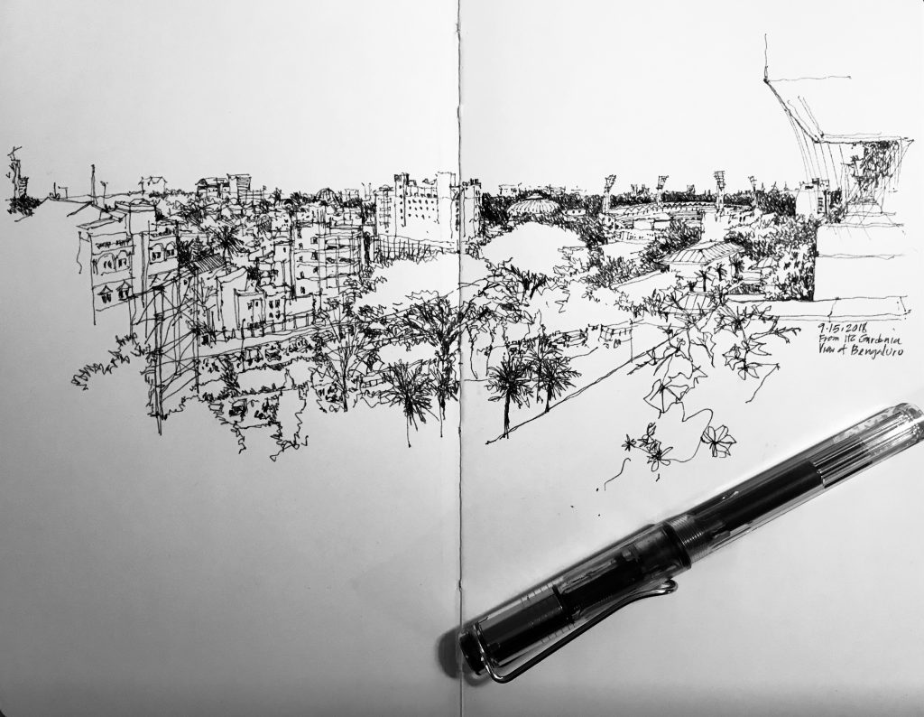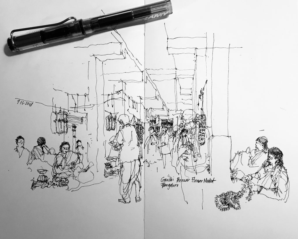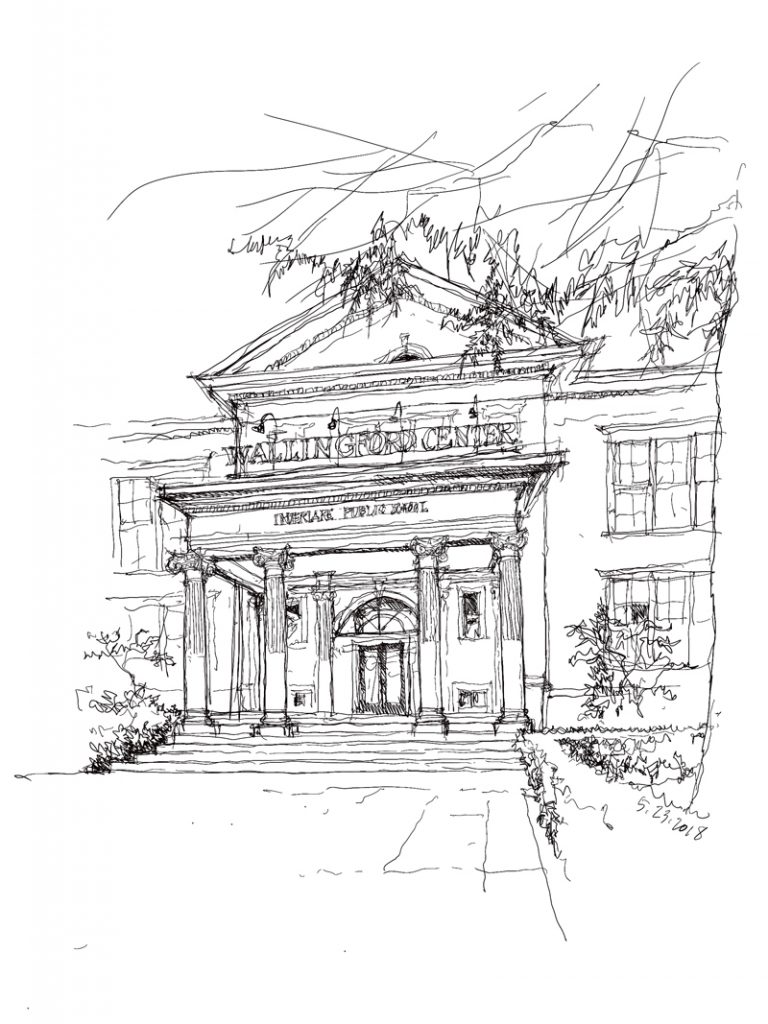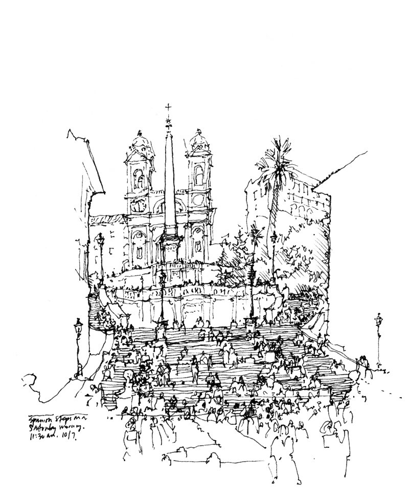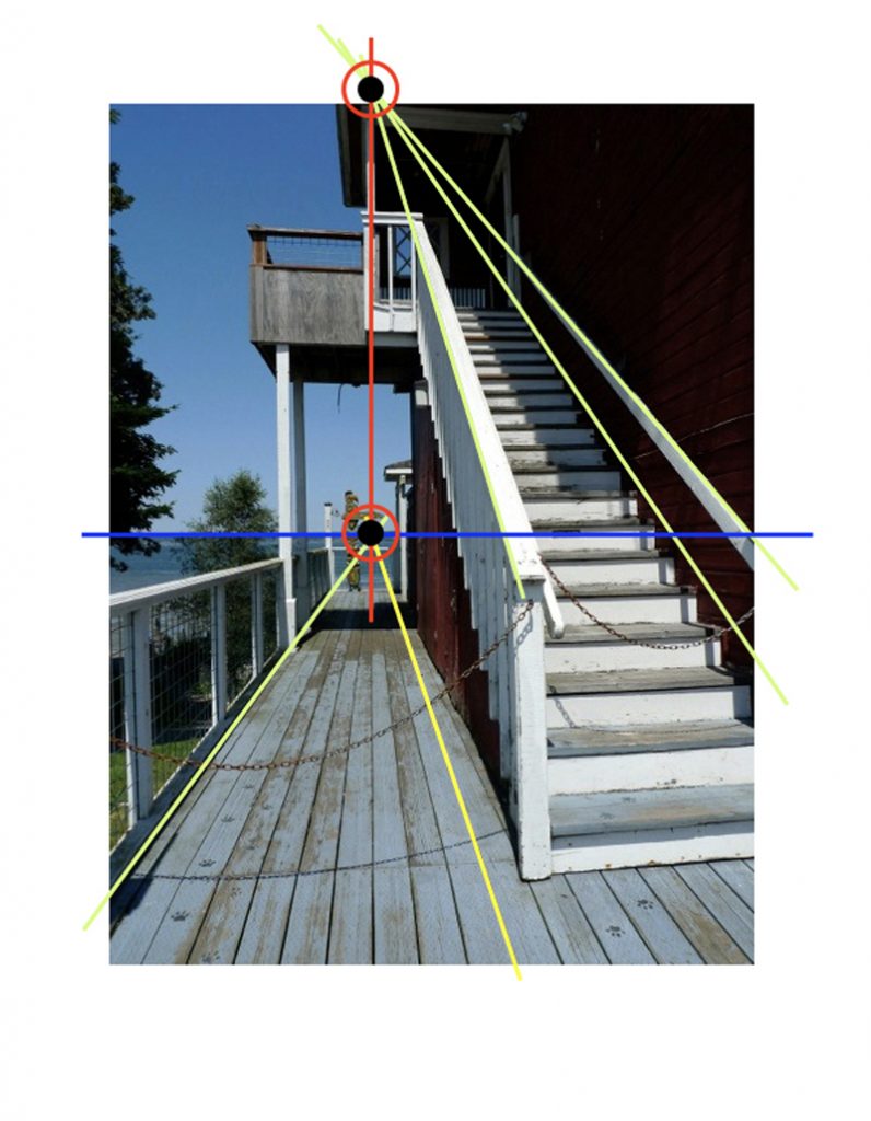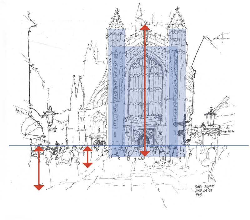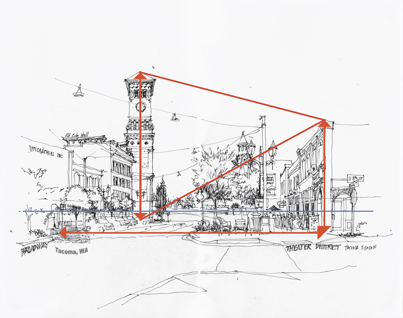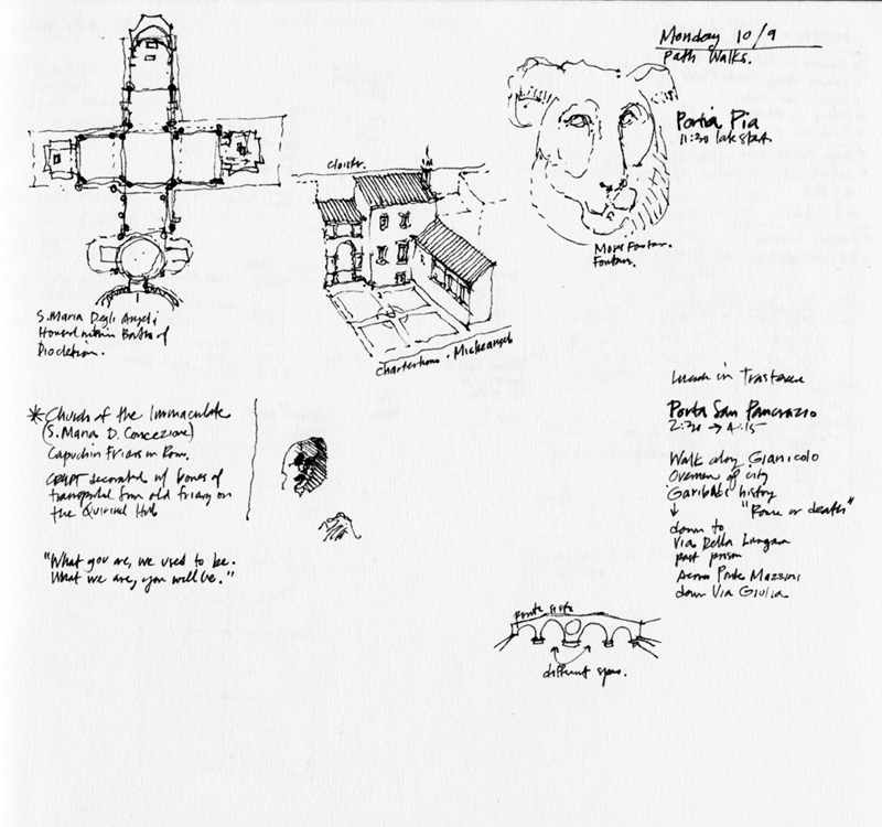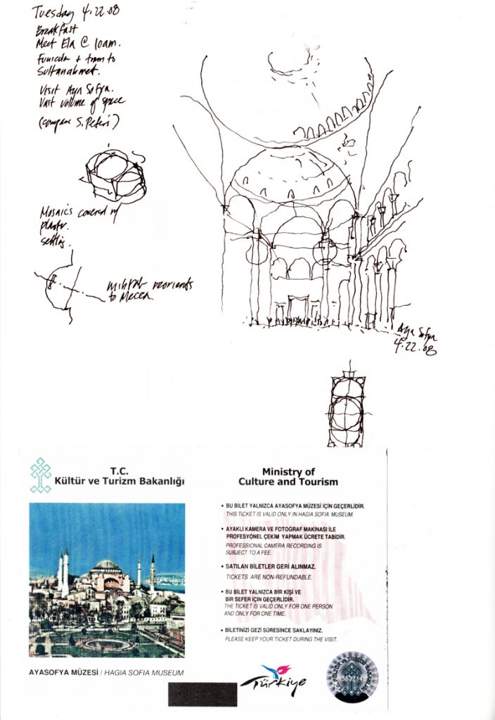
Once we have decided on the subject for a sketch—a scene, a building, or a fragment of a building—the next step is an important one in which we search for a vantage point from which to view and capture the subject. In so doing, we are in effect organizing the visual elements and focus of the drawing composition. Moving one way or another alters our viewpoint and thus the way the compositional elements relate to each other on the page.
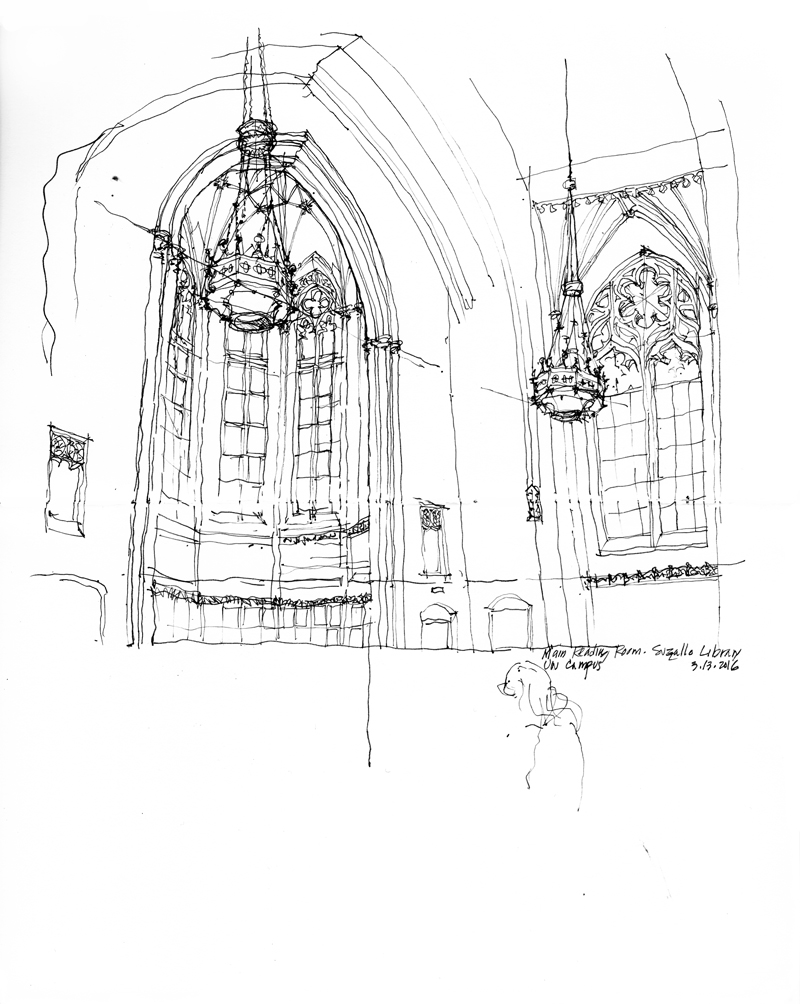
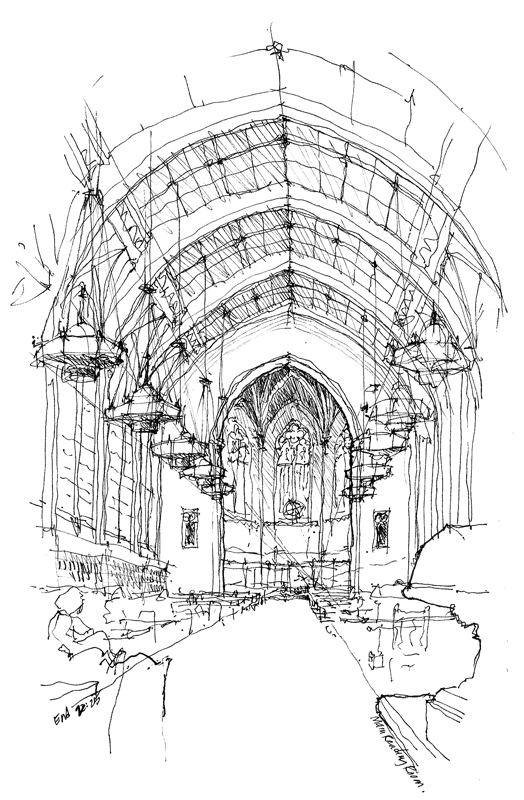
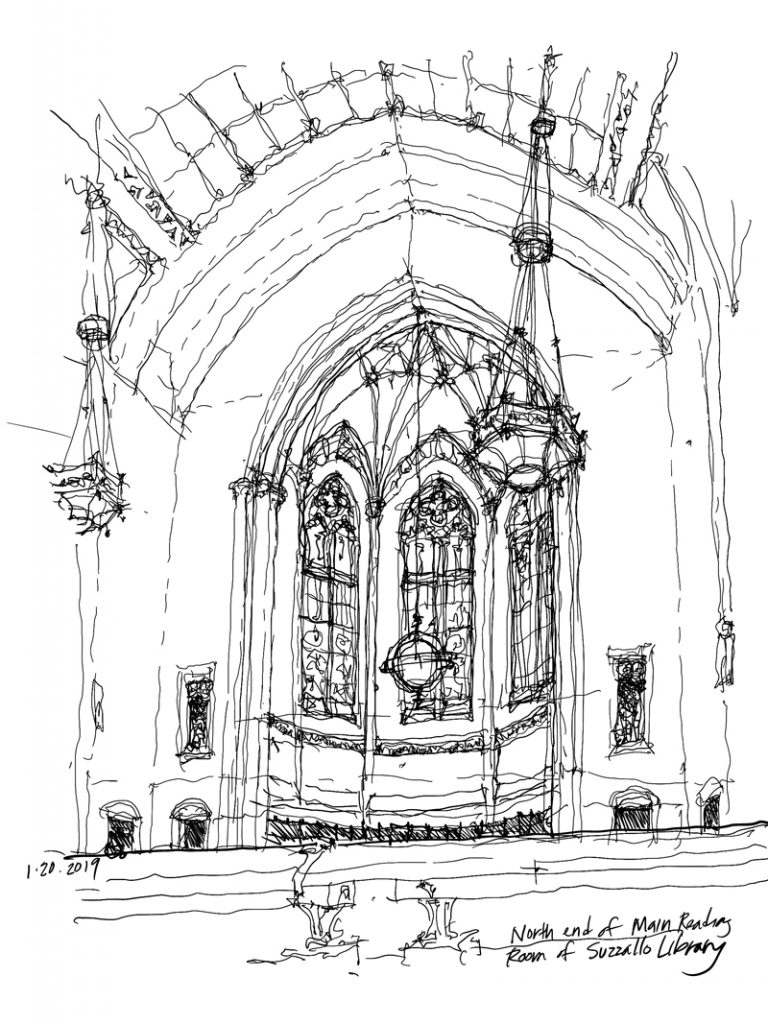
And so, deciding where to stand or sit should be more than a matter of convenience or comfort. Rather, it should be determined by the composition a particular viewpoint offers. To illustrate, here are three different views of the main reading room of Suzzallo Library on the University of Washington campus, a beautiful example of Collegiate Gothic architecture.