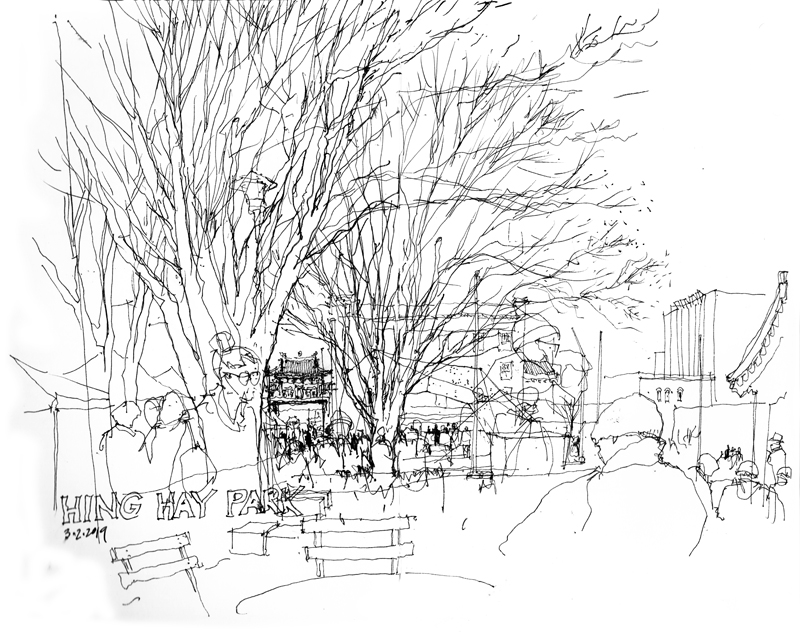
On a bright, sunny but cold day, the International District celebrated the Chinese New Year at Hing Hay Park. The festivities had been delayed because of a snowstorm that hit Seattle a few weeks ago. This drawing was done before the day’s events started and before crowds of people would block this view. I chose to merely suggest the immediate surroundings of the park and instead highlight the gateway or “paifang”further down King Street.
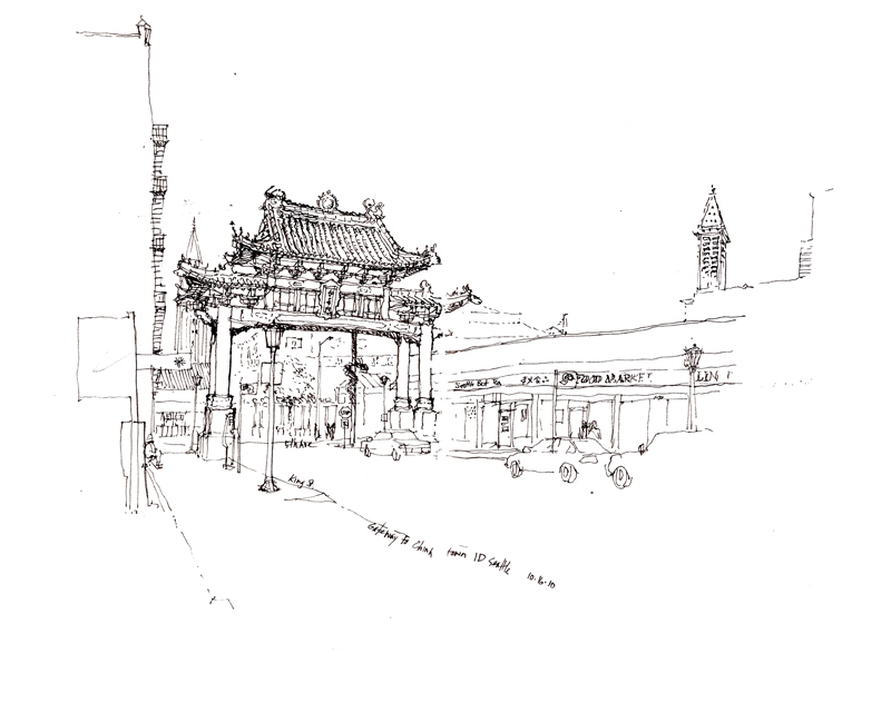
Here is another drawing of the gateway done about 8 years ago.
Looking out at a scene, whether it be an interior space or a public square, we can usually discern three zones of depth—what is near to us in the foreground, what is in the middle ground, and what lies beyond, in the background. As we scan what lies before us, both at what is near and what is farther away, our eyes are capable of focusing and refocusing extremely fast, making it seem that everything is in focus all of the time.
But to convey a sense of space and depth—spatial depth—on the page, an effective graphic means is to treat each zone of depth differently. So we might, as in the first example above, treat the background with more emphasis and merely outline or suggest what lies in the foreground and middle ground, which we use to frame the view.
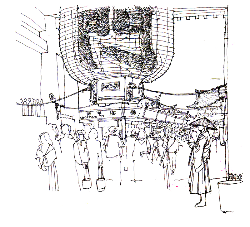
Or we can focus on what is in the foreground and blur or merely hint at what lies beyond, as in the view of Asakusa Temple in Tokyo above.
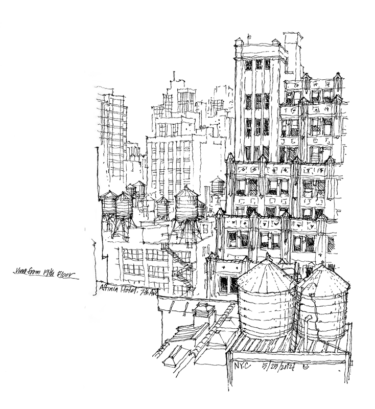
Or we can emphasize the middle ground and outline the foreground and fade out the background, as in the above view of New York City.
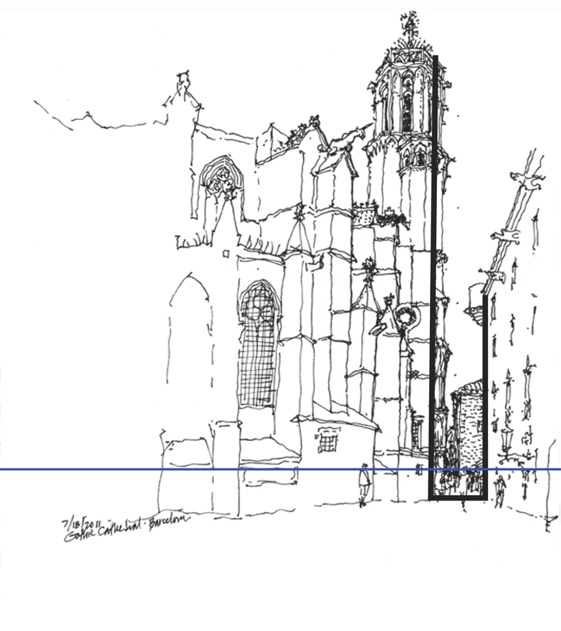
A question often asked is how to begin a drawing on location. Once we have selected a point of view and mentally composed the picture, one way to begin is to select a vertical plane in the scene, which can be the facade of a building or a wall of an interior space, and drawing this plane before delineating the horizon line—our eye level—relative to that plane.
It is important to properly size and locate this vertical plane relative to the page or sheet of paper to ensure that the entirety of the intended image will fit. If the initial plane is drawn too large, we may have to crop some of the intended image or worse, we might be tempted to alter the proportions of the scene to fit the page. Also, if the vertical plane is placed too far to the left or right, or too high or low on the page, the resulting composition may be distorted.
The initial vertical plane need not be a physical one. It can also be a virtual one, such as the cross section of a church nave or the width of a street.
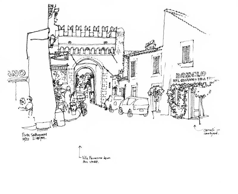
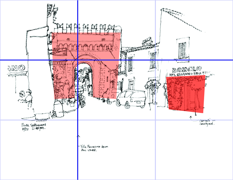
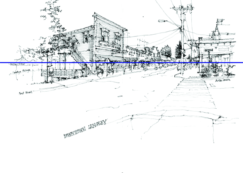
Once we have decided on the subject matter for a sketch and established a particular point of view, we turn our attention to framing and composing the view on the page. A useful guide about which I had posted five years ago is the rule of thirds. Many photographers are familiar with this strategy of divided the image field into nine equal parts with two equally spaced horizontal and vertical lines, and placing points of interest at any of the points of intersection or laying out important compositional elements along any of the horizontal or vertical lines.
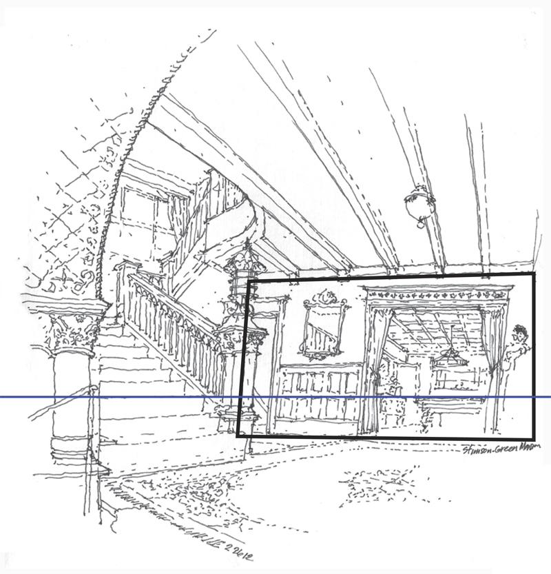
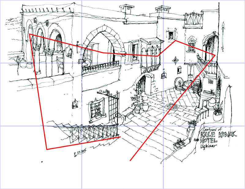
Overlaying this grid of thirds onto the above drawing shows how the plane of the porta is placed at the upper left intersection and is balanced by the element on the right.
Here are two drawings, both of which use a horizontal line as the basis for the composition. One is along the lower third to emphasize the view upward while the other is on the upper third to show the foreground and convey a greater distance between the viewer and what is viewed.
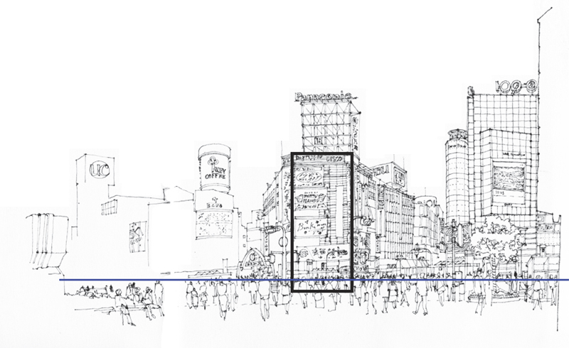
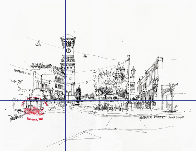
In this drawing, both a horizontal and a vertical grid line serve to organize the urban scene.
Of course, the rule of thirds is not a precise method for placing compositional elements. Rather, the general idea is to place important points of interest off-center to create greater visual tension and more dynamic compositions.
And sometimes, the scene requires accommodating multiple centers of interest that draw the eye into and around a drawing.
Once we have decided on the subject for a sketch—a scene, a building, or a fragment of a building—the next step is an important one in which we search for a vantage point from which to view and capture the subject. In so doing, we are in effect organizing the visual elements and focus of the drawing composition. Moving one way or another alters our viewpoint and thus the way the compositional elements relate to each other on the page.
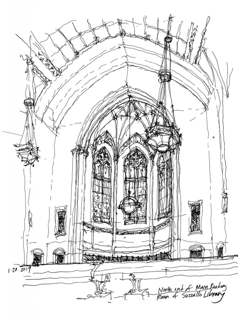
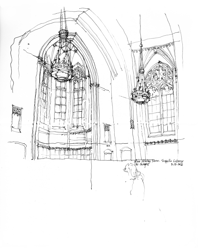
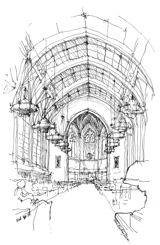
And so, deciding where to stand or sit should be more than a matter of convenience or comfort. Rather, it should be determined by the composition a particular viewpoint offers. To illustrate, here are three different views of the main reading room of Suzzallo Library on the University of Washington campus, a beautiful example of Collegiate Gothic architecture.
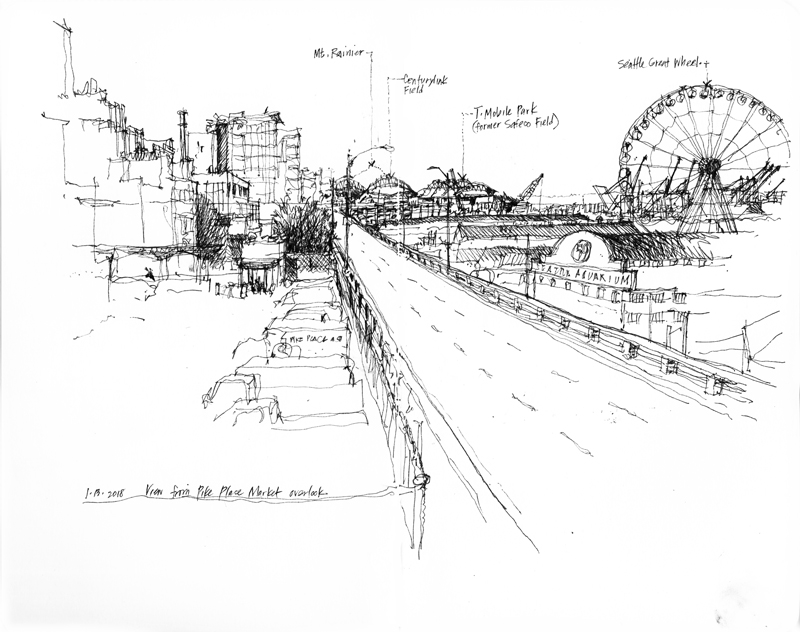
The Alaskan Way Viaduct, a two-level elevated freeway that is part of State Route 99, was built between 1949 and 1953 to carry traffic along Seattle’s waterfront. When the Nisqually earthquake hit in 2001, the viaduct suffered minor damage but raised concerns that another major earthquake could cause it to collapse. And so, after a lot of civic and political debate, the state and city decided to replace the viaduct. After considering rebuilding another elevated structure, a surface boulevard, or a cut-and-fill tunnel, the decision was made in 2009 to bore a 2-mile-long tunnel deep below downtown Seattle. After years of delays, boring finally began in 2013, and the completed tunnel is scheduled to be open to traffic in three weeks.
The Alaskan Way Viaduct was officially closed to traffic at 10 pm this past Friday, January 11, 2019. What I will miss, along with many others, I’m sure, are the fantastic views of Elliott Bay and the Olympic Mountain Range to the west while traveling on the upper deck traveling north, especially at sunset.
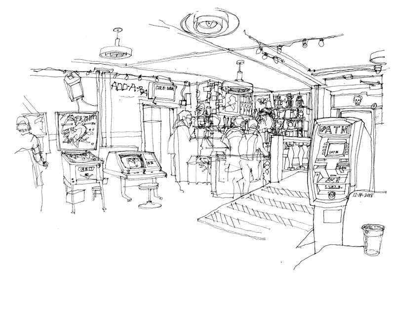
Just off the alley behind and beneath 315 North 36th Street in Fremont is Add-A-Ball, an old-style arcade filled with rows of pinball machines and other arcade games, including such classics as PacMan and Tetris. Quoting The Stranger, “It’s the basement you wish you could’ve had when you were 14, if you were 14 in 1983.”
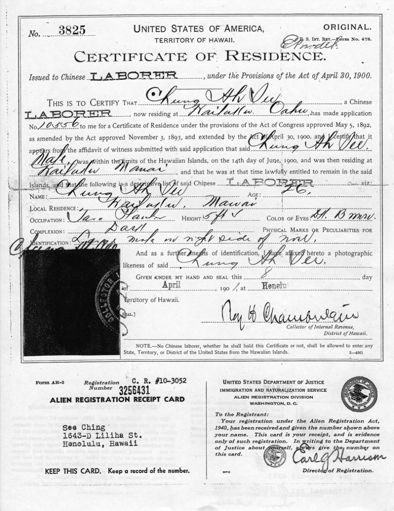
On this date 75 years ago, President Franklin D. Roosevelt signed the Magnuson Act into law. Proposed by then Washington State Representative Warren G. Magnuson, the act basically repealed the Chinese Exclusion Act of 1882, permitted limited Chinese immigration, and allowed some Chinese immigrants already residing in the U.S. to become naturalized citizens. But the act still banned ethnic Chinese from owning property and businesses.
This reminds me of my own grandparents on my father’s side, who immigrated to Hawaii as laborers. Above is a copy of my grandfather’s Certificate of Residence, signed in April 1901. There are a few things to note: First is the misspelling of my grandfather’s surname. Second is that this document was required by the provisions of the Act of April 30, 1900. This was the so-called Organic Act, which provided a government for the Territory of Hawaii, after the overthrow of the Hawaiian monarchy by mostly U.S. business interests in 1893.
And third, notice that the registration card at the bottom was required by the Alien Registration Act of 1940. While the primary intent of this act was to make it illegal for any resident or citizen in the United States to teach or advocate the overthrow of the government, it also forced non-citizens, such as my grandparents, to register so that the government would be better able to track them and their possibly un-American ideas or activities.
We can sometimes forget how complicated our cultural and political history has been.
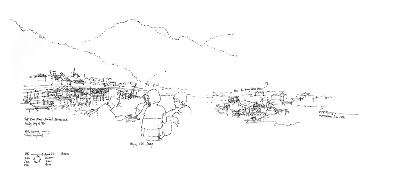
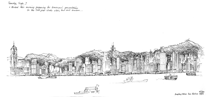
A drawing done 20 years ago, after arriving on a ferry from Hong Kong Island to Yung Shue Wan on Lamma Island, and then walking for an hour-and-a-half to Sok Kwu Wan. In contrast to this rather sparse sketch is another drawing I did five years earlier of this skyline as seen from Kowloon, which uses a lot more ink to convey the dense, urban fabric of Hong Kong Central.