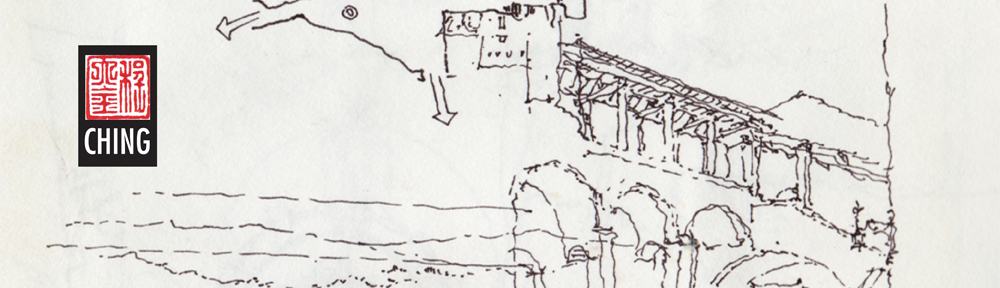
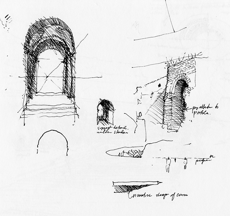
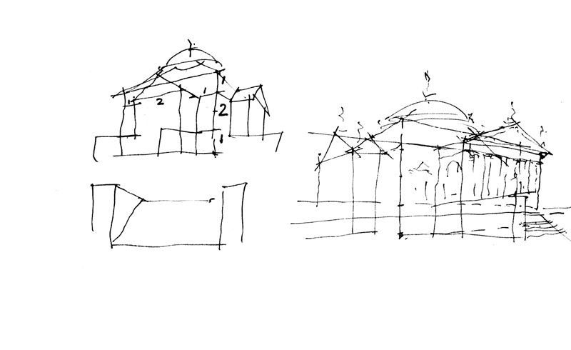
From a Rome journal, two pages of sketches drawn during a teaching session. The first page contains explanatory sketches accompanied by bits of concise text: “Pay attention to profiles”…“Suggest details within shadows”…“Visualize shape of curves.”
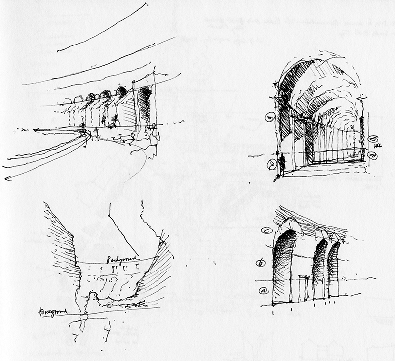
The second page illustrates how to estimate proportional heights above and below an imagined horizon line.
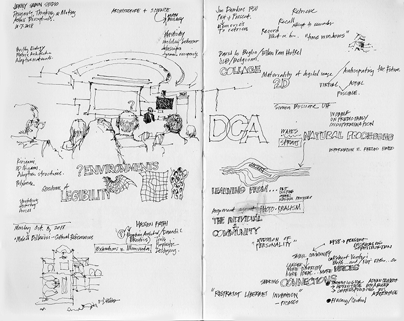
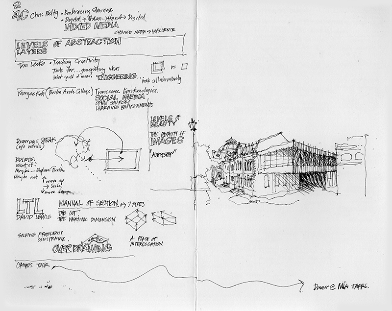
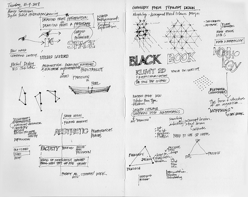
Being able to listen, absorb, and process information during a lecture or conference is a valuable skill, one that can be practiced and cultivated by taking notes by hand. These notes can often be augmented with word diagrams and visual imagery that come to mind to reinforce points being made or expressing one’s understanding of what is being said. Here are a few pages of notes I took during a Design Communication Conference in 2018. See also my posts on 10.30.16 and 10.14.20 on the similar subject of taking visual notes.
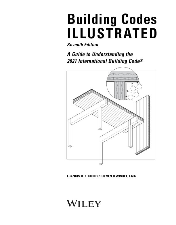
Even with the nice, sunny weather we’ve been having, there hasn’t been enough time to go out and capture scenes in and around Seattle. I’ve been busily working with Steve Winkel and editors from Wiley and the International Code Council on revising Building Codes Illustrated to incorporate the changes effected by the 2021 edition of the International Building Code. For example, the title page above reflects how the development of mass timber construction has led to the creation of new categories of Type IV construction.
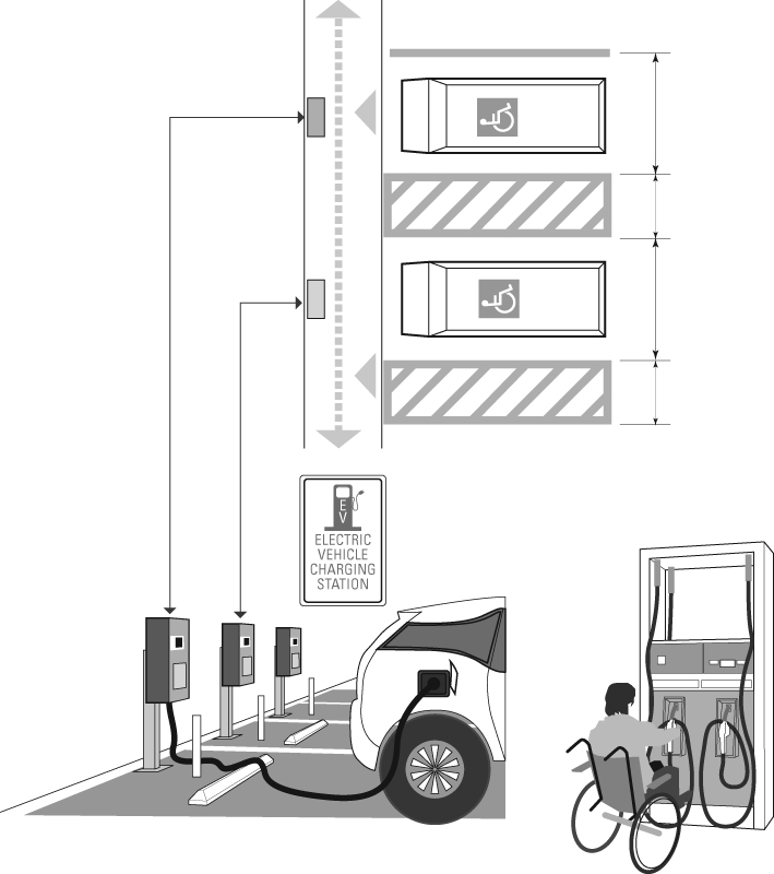
This page illustrates the necessary provisions for accessible electric vehicle charging stations (EVCS).
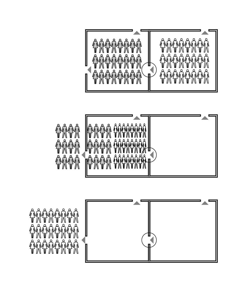
This series of illustrations is an example of how the book attempts to explain in graphical terms the intent of code requirements. In this case, these graphics illuminate the theory underlying horizontal exits.
Note: All of the illustrations in BCI were created in Adobe Illustrator.
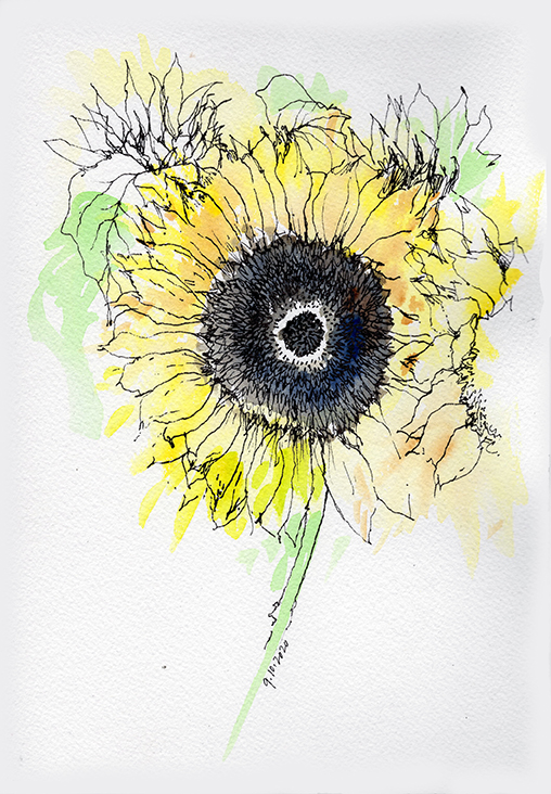
In these uncertain times, flowers always seem to uplift spirits and brighten days. And so instead of gravitating toward my usual wide-angle views of buildings and urban spaces, I decided to do this study of a sunflower we had among others in a vase on our dining table. I first dabbed some watercolor on the d’arches cold pressed watercolor paper. After the watercolor had dried, I then drew over it with my trusty Lamy fountain pen. A fun exercise.
I remember a time when radios had an analog dial for tuning. To tune to a certain station, we had to turn a knob to align a moving hand with the desired frequency on a linear or circular dial. We had to rotate the knob back and forth and listen as the signal would get louder the closer we got to the desired station’s frequency, then get softer as we went past that point, and then back again to when the signal was loudest. The goal was to hone in gradually on that sweet spot where the signal was clearest and strongest.
Today, of course, with digital tuners, we simply have to scan and look at digital readouts. If a station has a frequency of 98.1, you merely dial that number in. Boom. Done.
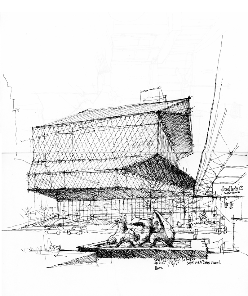
I think of this comparison of analog dials and digital tuners as a way of contrasting the precision of digital vector graphics with the suggestive power of a hand drawing, which requires a tactile feel along with a lot of judgment about how what we draw matches up with what we actually see. if you look closely at the drawing of the Seattle Central Library above, you will see the multiple attempts I made to get the proportions of the Rem Koolhaas/OMA-designed building right. Each attempt was a turn of the virtual tuning knob until I reached the desired frequency.
What do we see when we look out upon a scene we are about to draw? This has often been a question on my mind during workshops that I have taught. I suspect that when two of us stand side-by-side and gaze outward in the same direction, we might not see the same things. And even it we did, we might not be seeing those things in the same way.
This is not an argument for getting everyone to see the same things in the same way, and therefore, producing identical drawings of a scene. Seeing is subjective, influenced by our individual interests, experiences, and what each of us expect or believe to be “out there.” And in some sense, what you actually see is always going to seem to be unknowable to me, except through your drawings.
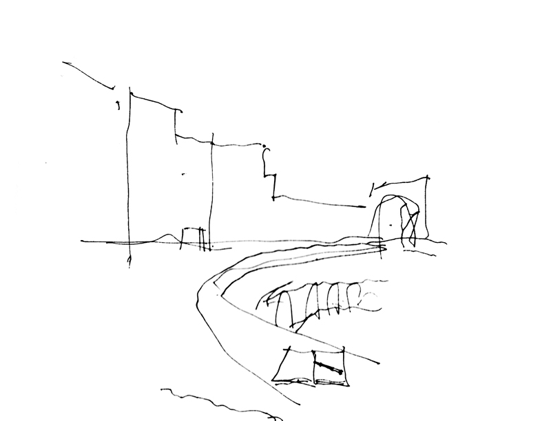
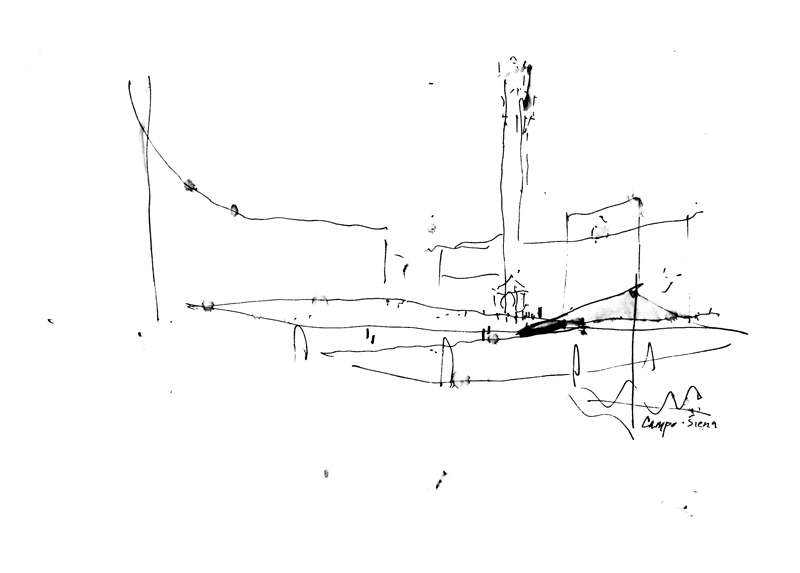
I am reposting something from six years ago: To begin a drawing done on location, we must first select an advantageous viewpoint that conveys a sense of place and frame the composition to fit on the page. Then, a crucial step is establishing the “bones” of the drawing—its basic structure—with the first lines we draw. For some views only a few lines may be necessary while for others, more might be required.
It is essential to understand that once this structure is established, changes can still be made to calibrate scale, improve proportional relationships, and adjust the positioning of elements. Drawing these first few lines is simply a way to block out the essential relationships on a page quickly, before expending too much time on a drawing only to find out that a portion might be misplaced or is out of proportion to the rest of the composition.
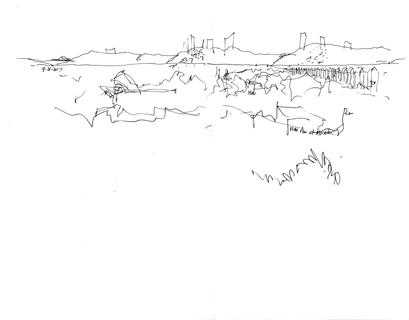
Here is an example—a very quick outline of a view of the Campo in Siena. With more time and better weather, I might have finished it but I think it is possible to see and visualize the space even in this incomplete state.
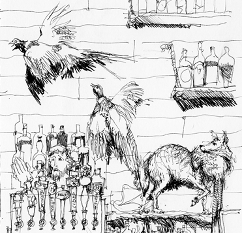
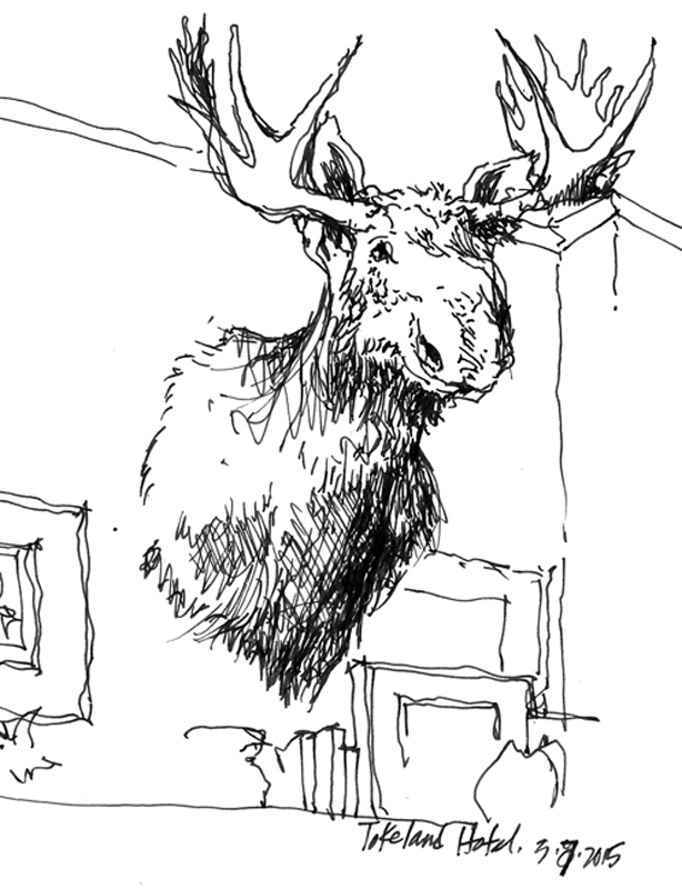
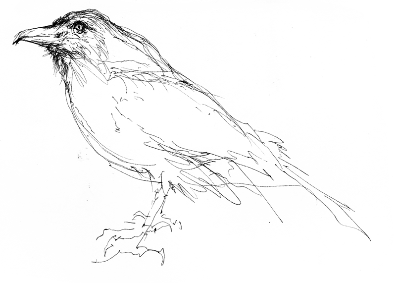
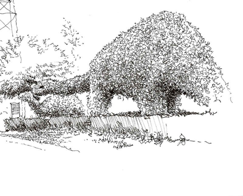
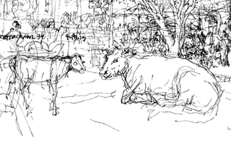
Here are several examples of animals, either stuffed or sculpted, that have snuck into my drawings of spatial environments but cropped to focus on the animal forms themselves. What I try to do with animal forms is infuse the imagery with a three-dimensional feel, remembering that almost everything we draw are three-dimensional in nature.
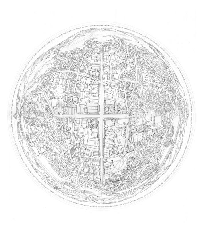
I accidentally deleted an email sent to me, I believe, from Augsburg. The sender was inquiring about a spherical perspective similar to the one shown above that I drew of Athens, Ohio, in 1976. The daughter, an art student, might be following this blog, and if so, I hope she will ask the sender to resend the email l so that I can respond properly. Thank you!