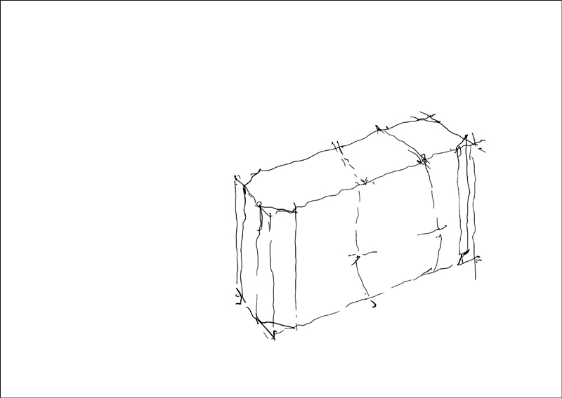
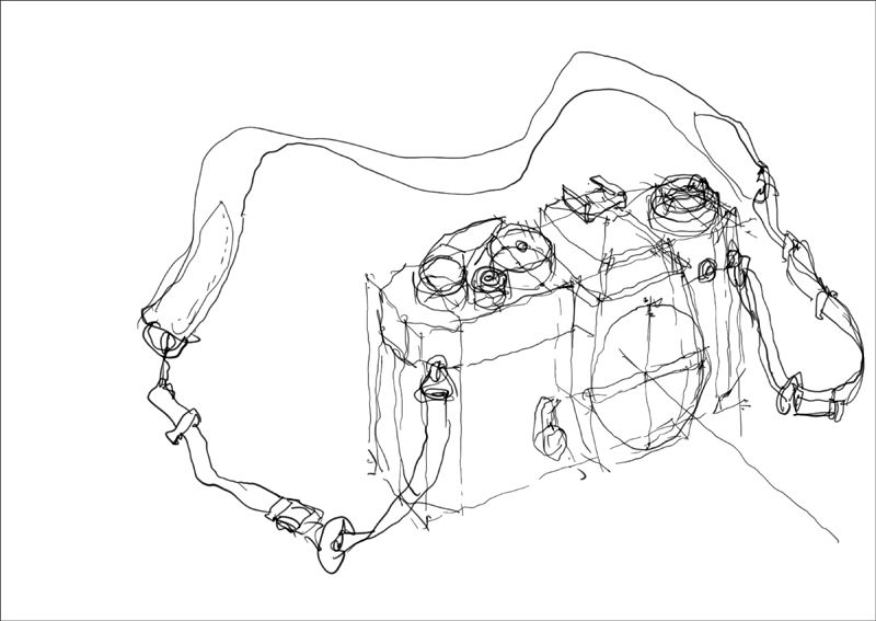
Continuing the series of drawings that shows the development of my sketch of a Nikon FE2 manual SLR. In the view above, the nobs and dials atop the camera body have been extended vertically from their positions in the previous sketch, and the neckstrap has been added.
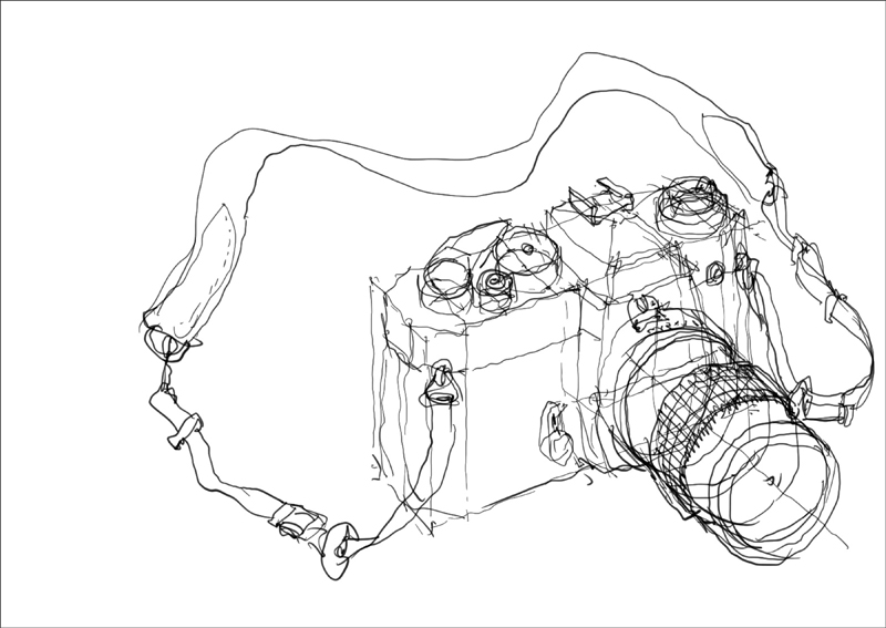
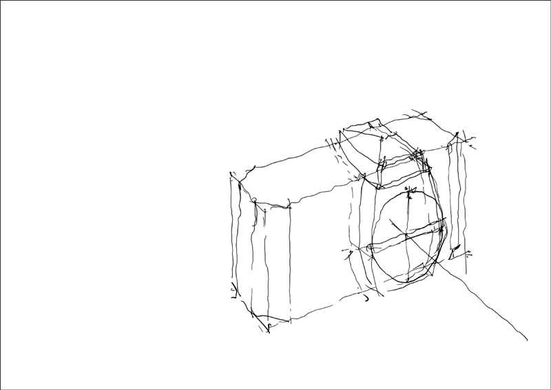
The 55mm f2.8 micro-Nikkor lens is projected outward from the camera body, using the previously drawn central axis as a guide for the circular forms.
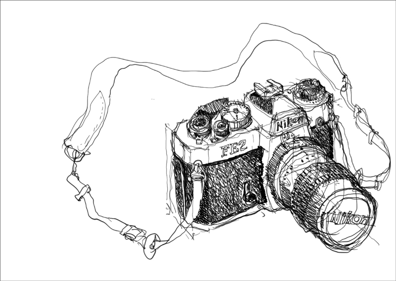
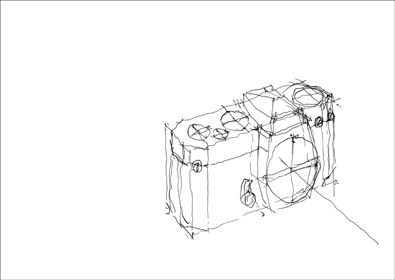
Finally, shading is added to indicate the dark mottled surfaces of the camera body as well as the curved forms of the knobs, dials, and lens barrel. The final touches included adding the Nikon logos on the prism housing and lens cap, and the etched FE2 on the camera body itself.
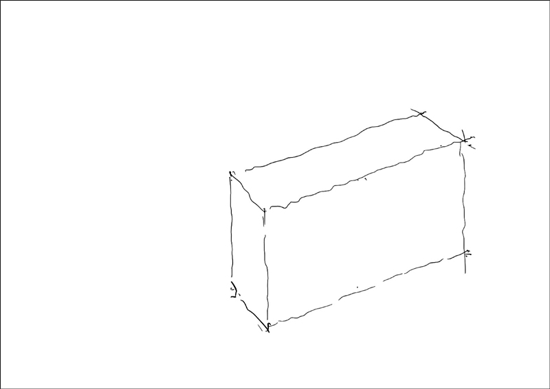
Note: This drawing was done using the Procreate app on an iPad with the Apple pencil stylus. This enabled me to capture stages of the drawing as jpeg images.