Fremont Coffee Redux

FremontCoffee

I took advantage of an ad hoc meeting of the Seattle Urban Sketchers at Fremont Coffee to sketch my favorite coffee shop, where I get my daily Americano. Above is an exterior view that I had done a couple of years ago. So today, I sketched two additional views, one of the interior and the other of the outside deck. I had a little trouble conveying the scale of the two spaces. Scale—in particular, human scale—is a difficult aspect to capture well but it is so important in describing the intimacy or expansiveness of a space.

EPSON MFP imageEPSON MFP image

Allosaurus Fragilis

EPSON MFP image

On display at the Burke Museum of Natural History and Culture on the UW campus is this Allosaurus Fragilis, a fleet-footed predator from the late Jurassic period.

The second image below shows how I attempted to keep the allosaurus in proper proportion. I first estimated that the height of the hind legs was about a third of the dinosaur’s overall length. You can barely see the tic marks that I used to divide the length into thirds. I then used this measurement to fix the height of the hind legs. I also judged the position of the hind legs to be a little more than a third of the length from the head. Finally, I drew the curvature of the spine to guide the development of the dinosaur’s skeleton.

EPSON MFP image

Being able to see and replicate proper proportions, no matter the nature of our subject matter, is an important skill in drawing.

Kailasanathar Temple

KailasnatharPhoto

At the end of my recent trip to India, Xavier Benedict and I drove down from Chennai to Kanchipuram, where we visited several Hindu temple sites. The most impressive of these was Kailasanathar Temple, the 7th-century Pallava shrine dedicated to the god Shiva. The sandstone structure has weathered over the past 1200 years but is being restored and retains its tiered, sculptural elegance.

While one can read descriptions, study drawings, and pore over photographs of architecture, nothing can compare with actually visiting and experiencing a place. The sights, sounds (or lack thereof), and sense of scale immediately become apparent upon entering. There is no need for any intermediary material. At the conceptual level, however, plans and sections do offer views that can explain the formal layout of a place.

KailasnatharPlan

It is Interesting to note the disparity that often exists between reality and how it may be represented. For example, after my visit, I noticed that the plan of Kailasnathar that I had drawn a few years ago is missing columns on the west entry porch.

EPSON MFP image

While I could appreciate the formal order of the temple compound and the artistic expression of the stone carvings, I also realized that not fully understanding the Hindu iconography prevented me from truly appreciating what I was experiencing.

Pike & Minor

EPSON MFP image

Despite recovering from a bad cold and feeling a bit under the weather, I decided to join the monthly Seattle Urban Sketchers outing this past Sunday. It promised to be an unseasonably warm and sunny day but it was still quite chilly in the late morning when I drew this view of Pike Street in the Capitol Hill neighborhood of Seattle, standing in front of the new Starbucks Roastery, looking east toward the domed First Covenant Church. Not my finest work but merely another step in the long process of learning how to say more with less. There is so much missing in this drawing, so many things that I saw but omitted, and yet, the overall feel for that particular place is still there.

Iconic Images

If we think of the Eiffel Tower, the Sydney Opera House, or the Chrysler Building in New York City, we can see the image in our head, even if we have never seen the real thing. It appears as though the stream of images we have seen in photographs and movies have been seared into our memory banks. And we might even be able to sketch reasonable facsimiles if asked to.

After we have visited a place several times, or lived near to, driven by, or walked past a place for a number of years, we might also form an iconic image of that place. A personal example is the Fremont Baptist Church, established in 1892 with the current brick building being constructed in 1924, perched on a hill above downtown Fremont in Seattle.

FremontBaptistChurch

For me, this iconic image of Fremont has materialized over the years. Yet the image I hold in my mind’s eye does not correspond to what you can actually see from any position on the street. What seems to occur is that our mind is able to recombine the fragmented, partial views we’ve experienced into a single iconic, memorable image.

About Copying

Back in 1963, an art history course at the University of Notre Dame required me to copy a number of art works. The idea was to supplement the reading about and viewing of art with the act of reproducing art. Here are three examples from my course notebook that I happened upon recently.

EPSON MFP imageDordogne Cave fresco of a bison

EPSON MFP image

Veronese’s Head of St. Mennas (detail)

EPSON MFP image

Frans Hals’ Young Flute Player

It had long been a tradition in the studio arts to copy masterworks as a way to gain proficiency, the thinking being that one could learn by imitating the compositional strategies, the strokes and blending of colors, and other techniques used by artists more skilled than ourselves. There are art teachers, however, who consider this type of copying to be a crutch and an obstacle to developing one’s own creative mind. Whether the practice of copying is good or bad depends ultimately on the reasons for doing so. The motivation for copying should not be merely the reproduction of a work. Rather, it should be seen as an attempt to explore the process of the original artist and just a single step in the learning process.

I should point out that drawing on location neatly sidesteps the question of copying. But note that even here, we are in a sense copying what our visual system takes in and interprets.

Surface and Depth

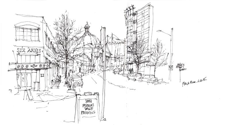
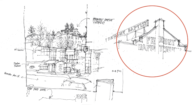
In the 1950s, the psychologist J.J. Gibson outlined a number of cues to depth perception. A few rely on our binocular vision and therefore do not apply to 2-dimensional drawings and paintings. Others, however, are psychological rather than physiological in nature. As such, these depth cues are pictorial in nature and are applicable to drawing and painting on a 2-dimensional surface. In the following, I try to use simple terms and snippets of my own drawings and photographs to illustrate each of the depth cues that I consider to be relevant to drawing on location.

Convergence

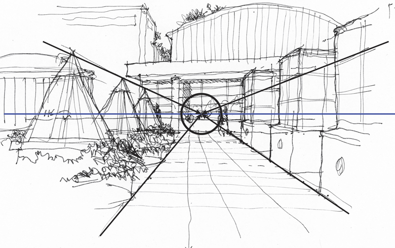
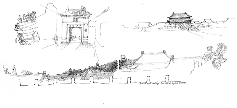
Convergence of parallels: This is a key characteristic of linear perspective in which parallel lines appear to converge as they recede into the distance. Despite the usefulness of the other depth cues, linear perspective remains the structural scaffolding upon which to build a sense of spatial depth on the page.

Overlap

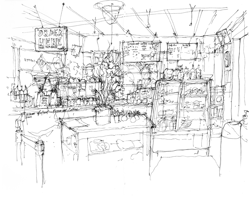
Overlap: Near objects overlap or partially block the view of objects farther away. Locating effective overlaps can be useful in selecting a viewpoint and composing a drawing.

Position

Position relative to the horizon: Objects below our eye level rise toward the horizon as they recede; objects above our eye level descend toward the horizon as they recede.

SizePerspective

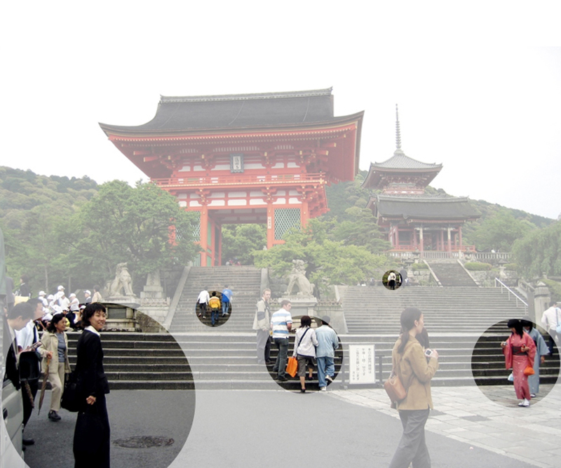
Relative size: Objects known or assumed to be of similar size appear to shrink in size with distance from the observer.

TexturePerspective

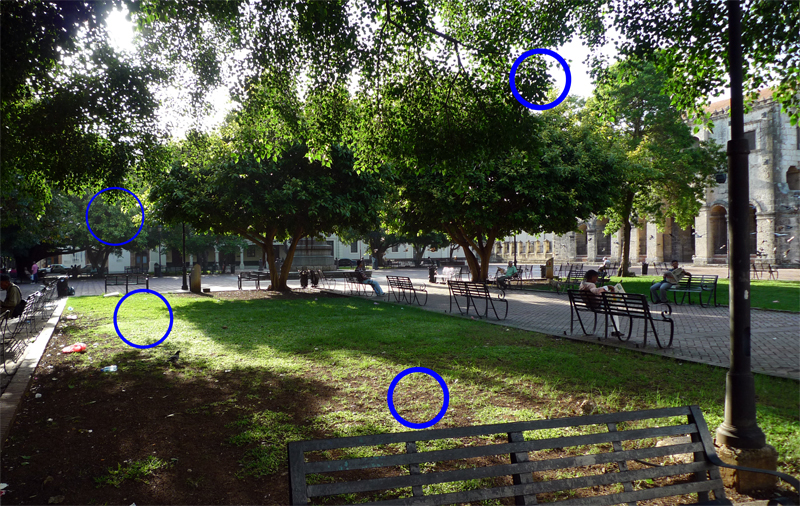
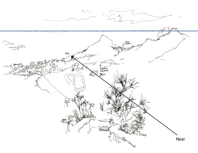
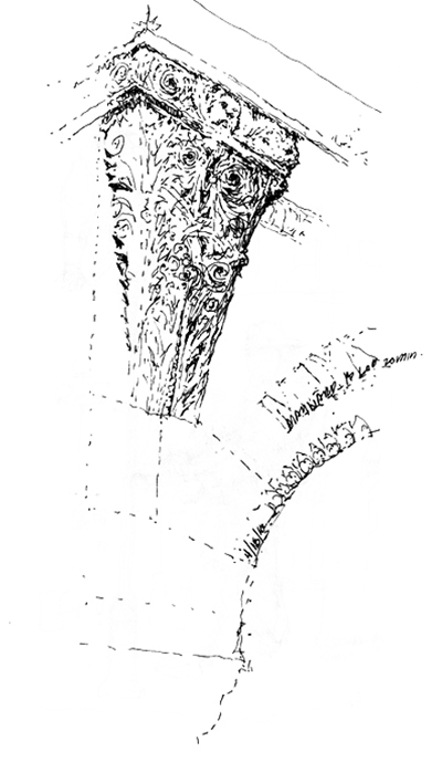
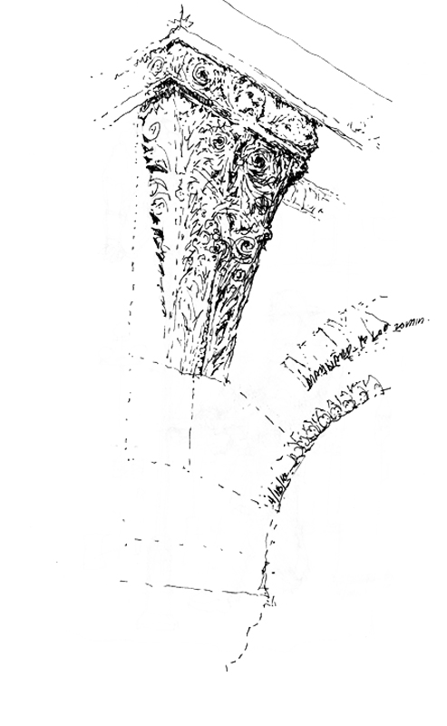
Texture gradient: Surface texture appears to get finer and smoother with distance from the observer.

Shading

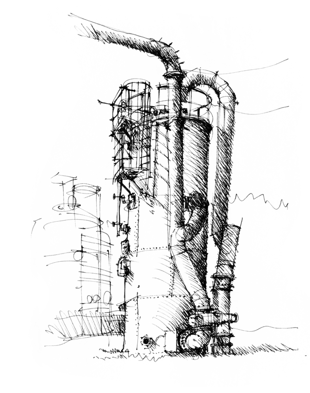
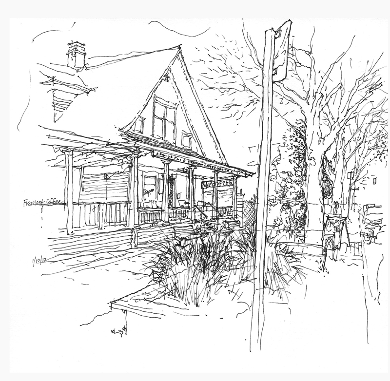
Shading and shadows: Contrasts in light and dark can convey the shape, form and depth of objects.

Atmosphere

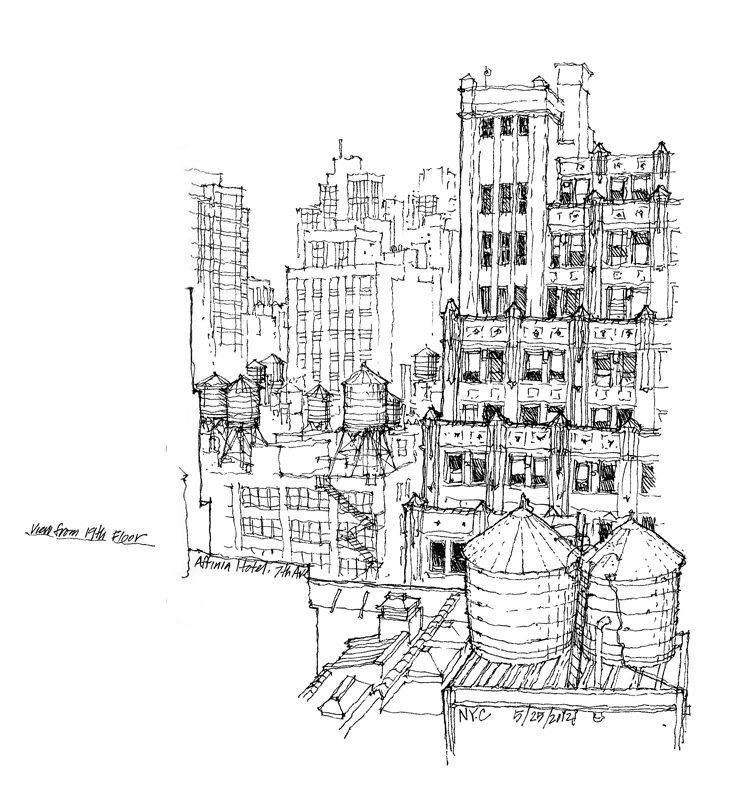
Aerial perspective: Particles in the atmosphere affects the color and visual acuity of objects at varying distances from the observer; distant objects appear grayer or bluer and less distinct than nearer objects.

As we can see, scenes more often than not comprise a number of these depth cues operating simultaneously. Seeing how these depth cues occur in our real-life perception can aid our understanding of why things appear as they do, counter to what we know of the things we draw, which are often in conflict.

Casa das Canoas

EPSON MFP image

While in Rio de Janeiro a month ago, we had the opportunity to visit Casa das Canoas, the first residence designed by Oscar Niemeyer in 1952. It is a true gem, nestled in a beautiful hillside setting and displaying the characteristic flowing lines of Niemeyer’s architecture. Thanks to Caique Niemeyer, Oscar’s grandson, for allowing us the privilege of touring this fine example of modern architecture.

After doing a few sketches of the exterior and interior of the deceptively simple structure, I attempted to draw a plan to try to understand the two-dimensional origin of what I saw in three dimensions.

EPSON MFP image

To verify my plan, I perused several books on the architecture of Oscar Niemeyer but none contained a plan of this house. Upon returning to Seattle, I did an internet search and found this plan drawn by Jeff Hottinger, which is included next to the plan I drew.

In this age of digital 3D modeling where much design thinking and decision-making is made from a perspective viewpoint, it is still a useful mental exercise to try to imagine the orthographic relationships that plans and sections reveal and which perspective views do not. As designers, we should be able to think two-dimensionally as well as three-dimensionally.

Negative Spaces

Along with a few fellow architect-volunteers from the community service committee of the AIA Young Architects Forum, I met this morning with a group of middle schoolers attending the Northwest School Summer Camp. Our task was to introduce some basic drawing concepts to the young students. My topic was negative space, a concept that is somewhat difficult to grasp, especially when translating the in-between spaces that we see in real life into the two-dimensional shapes we draw on paper. After the session, I remembered an animation that I had created a while back when I was conceiving of a ebook on drawing. Here is an unedited version of Seeing Shapes.

SeeingShapes

Keep in mind that it is often easier to see shapes in a photograph and more difficult to see them when drawing on location from direct observation.

Black and White

With the rise of digital photography color has become pervasive, unlike the film era where black-and-white photography was prized for its confident and raw visual style. In the field of sketching, too, color sketches are often seen as richer and communicating more information than monochrome drawings, which many consider to be primitive and lacking emotion. Yet, utilizing a range of strokes, black-and-white sketches can express a wider range of feelings than one might expect…

from light and airy…

B&W1

to dark and heavy…

B&W2

from descriptive…

B&W3

to illusory…

B&W4