Palomino Blackwing

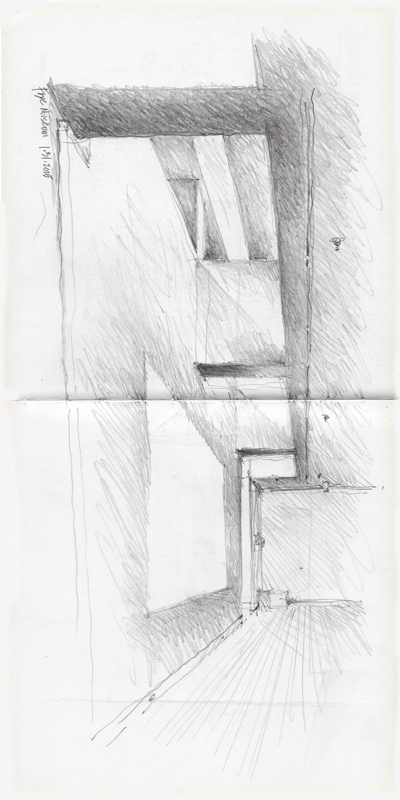
Having been given a Palomino Blackwing 602 pencil recently, I wanted to try it out. First produced in the 1930s by Eberhard Faber, the original Blackwing 602 had a firm feel yet the lead also had a softness similar to that of a 6B pencil. The 602 is said to have been favored by several prize-winning writers, musicians, and artists. The line was discontinued in 1998, but Palomino, a California Cedar Products Company with a long history in the pencil industry, re-introduced the Blackwing 602 in 2011 as well as a slightly softer version, which I used to sketch the Lenin Statue in Fremont.

EPSON MFP image

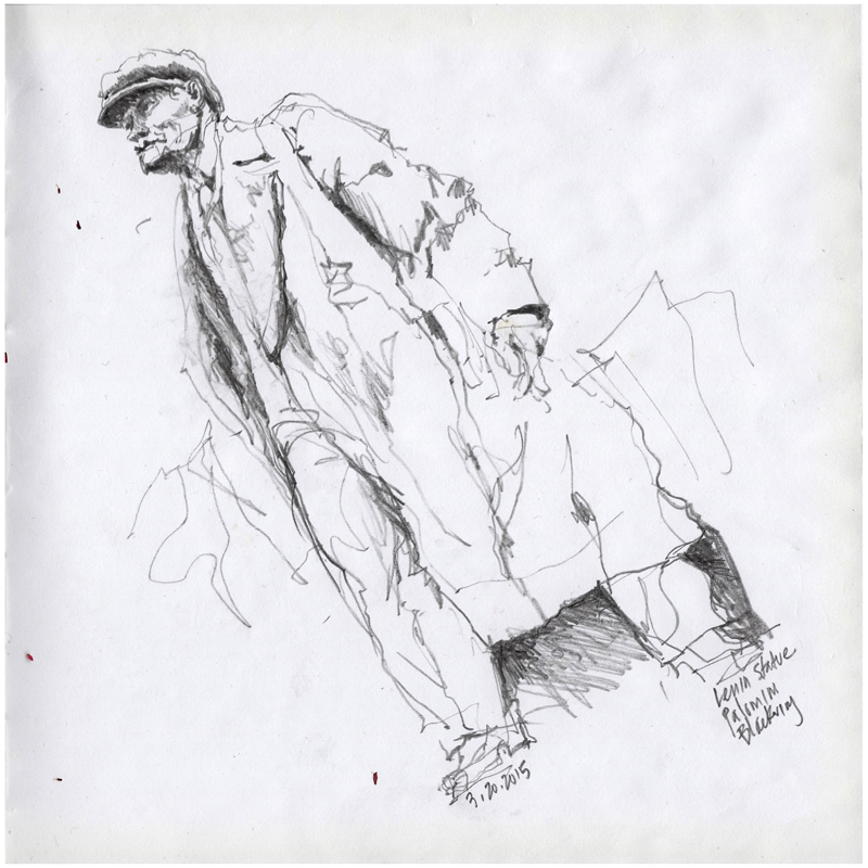
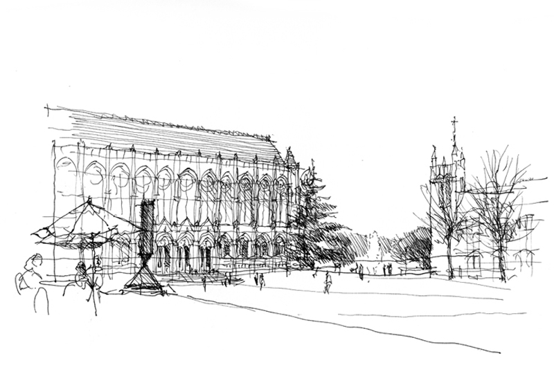
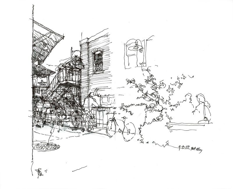
As we can see, graphite pencils are capable of a variety of lines and tones but lack the incisive quality of ink lines. As a light drizzle began to fall as I drew, I also discovered that graphite pencils are capable of drawing even on slightly damp paper. For comparison, I’m reposting an ink drawing of the same subject, which I had done back in 2011.

LeninSculpture

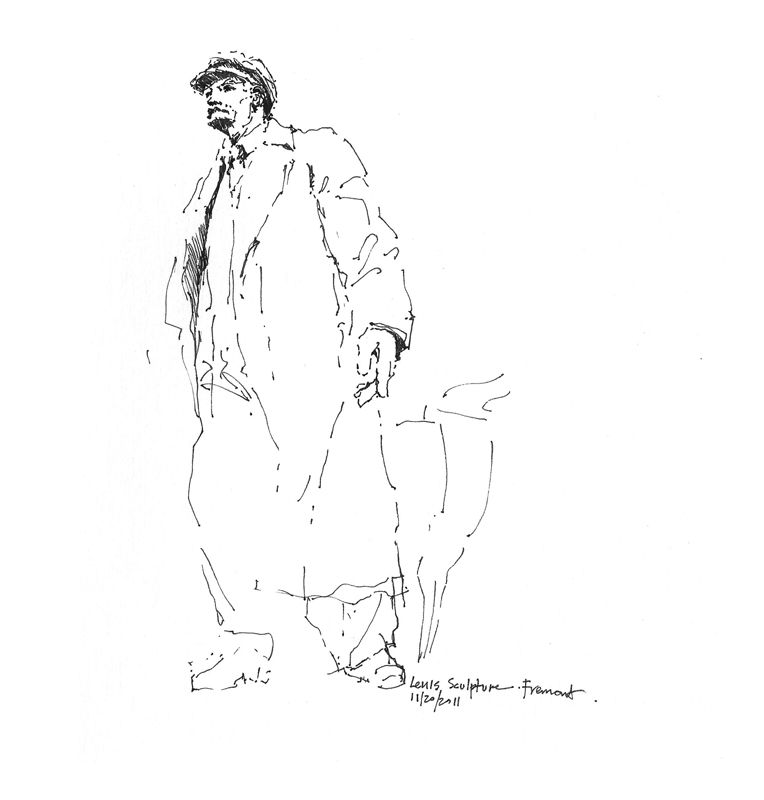
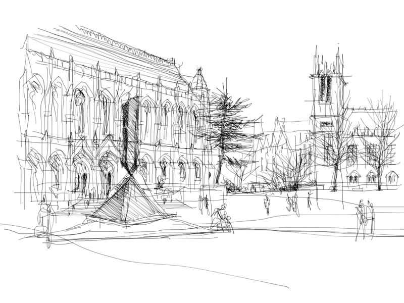
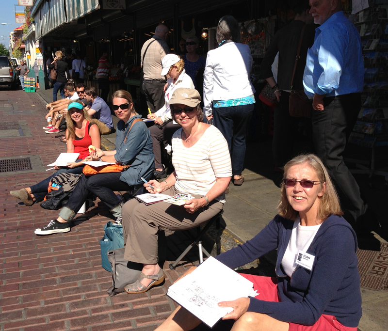
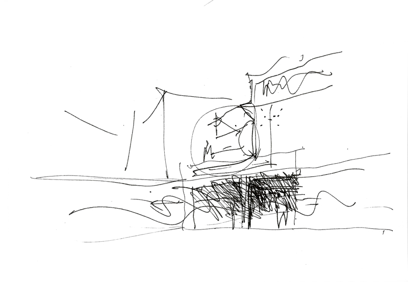
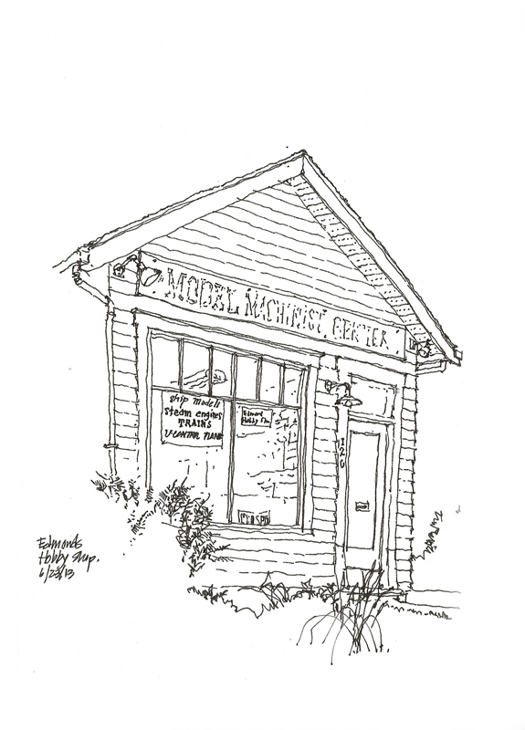
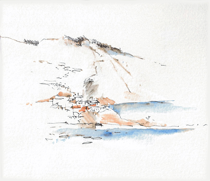
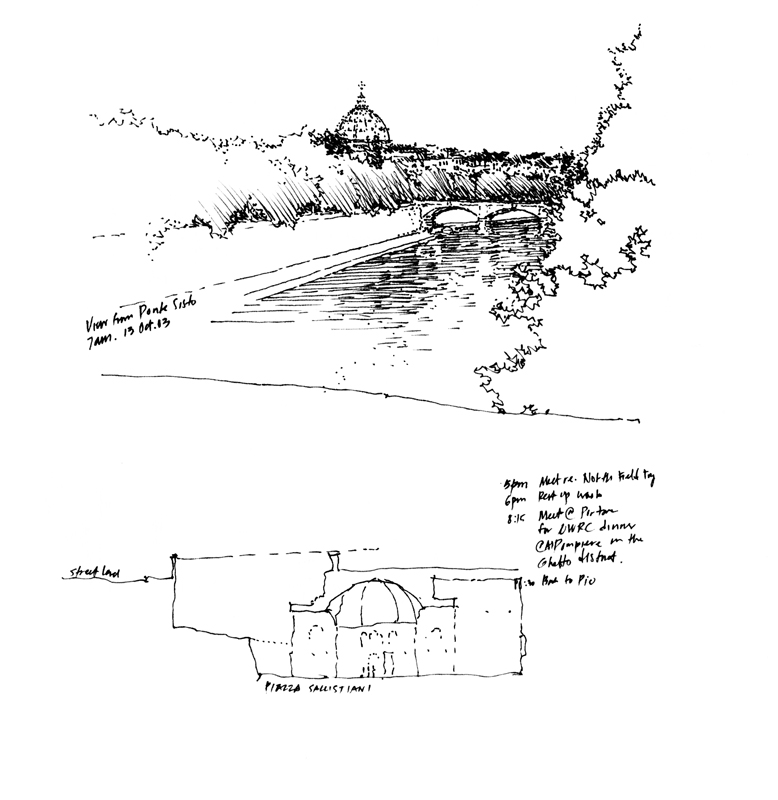
Pen-and-ink drawings, having only black lines at their disposal, tend to be more abstract and must use hatching, broken lines, and contrast to suggest the gray tones we think we see.

Frye Art Museum

A small group of Seattle Urban Sketchers met yesterday at the Frye Art Museum to participate in the 46th World Wide Sketchcrawl. Because only graphite or colored pencils are allowed in the museum, I brought along an old-fashioned mechanical lead holder equipped with a 4B lead.

EPSON MFP image EPSON MFP image

Switching from a fountain pen to a graphite pencil forced me to adjust my usual approach. Graphite pencils respond to pressure much more readily than an ink pen and encourage the use of tonal values. So the process I used was to first sketch the structure out lightly and then hatch broad areas of gray. I then wend back and darkened selected portions to achieve the desired gradation and contrast. Each of these sketches took about 30 minutes to complete.

Two Views of Red Square

RedSquare1

Back in 2010, a number of videos were shot of me drawing scenes on the UW campus. Here is the sketch I did of Red Square with Suzzallo Library in the left background, Gerberding Hall to the right, and a table setting and Barnett Newman’s sculpture, Broken Obelisk, in the foreground. During a break in the rainy weather we’ve been having the last few days, I again went to draw Red Square, this time drawing a slightly different view with my iPad Mini and the Brushes app.

RedSquare

Drawing with my forefinger on a glass surface that is only 6.25 x 4.75 inches in area fosters the use of more gestural strokes and inhibits the drawing of fine details. Even though the strokes are only one pixel wide, I found myself suggesting rather than describing because I wasn’t willing to constantly zoom in and out and painstakingly work pixel by pixel. I’ve tried a number of styli but haven’t found one that is a reasonable substitute for the nib of a fountain pen due to the nature of the capacitive touchscreen display.

Still, the overall process of establishing perspective structure first before adding tones and details remains the same as when drawing with a pen on paper. I hope to show this when I export the data and convert the actions into a Quicktime movie.

Seattle Workshop: Fall Edition

SeattleWS1

I want to thank Gail Wong and all of the participants in our Line to Color workshop for a fun and stimulating weekend. For me, it was inspiring to see and feel the energy emanating from the group as we sped through downtown Fremont Saturday morning, settled into Gasworks Park in the afternoon, and then reconvened down at bustling Pike Place Market on Sunday, all the time being blessed with great weather and company. After a workshop it’s always difficult for me to gauge the impact of what two-and-a-half days of drawing can have but I did see a lot of progress and hope all who attended will continue to pursue and enjoy this creative activity.

SeattleWS4

Being occupied with working with each of the participants, I didn’t have much time to draw on my own. But here a couple of very quick sketches. The first is one of my teaching sketches that I do to demonstrate how to block out a composition on a page.

SeattleWS9

The second is a market scene where I dabbled with a waterbrush that I borrowed from Daniel, one of the participants, to see how the it might react with the ink lines. I kind of like the effect even though it’s quite subtle. The ease of creating gray washes with a waterbrush might be the first step toward incorporating color into my drawings.


A Brief History of Bookmaking

Following up on a previous post about the making of Green Building Illustrated, here is a brief history of my publications.

My first book, Architectural Graphics, was published 38 years ago, in 1975. Due to the efforts of Forrest Wilson, Van Nostrand Reinhold offered me a contract based on of over 400 pages of notes I had prepared for the very first class I taught at Ohio University. I still remember condensing those notes and handlettering and drawing the final camera-ready pages with a Scripto lead pencil, a triangle, and a scale. I completed all 128 pages in a little over three weeks. Here is a sample page.

AG

Building Construction Illustrated soon followed, using the same tools and process. But this time I worked on tabloid-size paper instead of letter-size bond paper. Interestingly, after a few years of complaints from bookstores, the pages were reduced to letter-size.

BCI

Wanting to use more subtle hatching and shades of gray, I used a 0.3 mm lead pencil to handletter and draw the images on Clearprint vellum for the camera-ready pages of my third book—Architecture: Form, Space and Order. Here are a couple of screen shots for a visual comparison.

AFSO AFSO2

My next post will describe the first time I used digital technology in my bookmaking.

Building Physical Models

EdmondsHobby

Seeing and drawing this humble hobby shop in Edmonds reminded me of how much I loved building models of all kinds—planes, trains, ships, and for a very brief time, even classical guitars. As you can see in this photo, I still have a few around.

PhysicalModels

Despite the allure of digital models and fabrication techniques, we can still learn a lot by working with real materials with one’s own hands, feeling attributes such as weight, texture, and grain. Unlike digital models, real materials tell us if we try to make them do things that they are not capable of. And in assembling physical models, we learn that sequence is crucial to success. We can turn a physical model over, not in our heads as we sometimes do with drawings or on the computer monitor as we do with digital models, but in real space and in real time. One can examine materials and joinery closely one moment, and then look at the whole from a more objective distance the next.

I still have a few model kits, just in case I ever find myself with some free time and nothing better to do.

Watercolor Trials

I’m still unpacking from our recent move and in the seemingly never-ending process, I discovered this Christmas card I had done in the late 1960’s. It reminded me of how I would take a few minutes to hand-paint these, one at a time, and send them to family and friends as holiday greetings—in the pre-digital age.

XmasCard

It seems that the majority of urban sketchers whose work I’ve seen use watercolors to render how they see their world and I sometimes yearn to incorporate watercolor again into my work. Yet I like the simplicity of a pen and paper and have not yet settled on a compact enough kit that is truly portable. Given the time, however, I periodically experiment with a very limited palette and the feel of a waterbrush. Here are a few of these experiments.

WCX1 WCX2 WCX3

Why I Like Drawing with a Fountain Pen

I usually sketch with a Lamy fountain pen, with the nib turned upside down for a finer line. When people ask me why, I tell them that I like the tactile feel of a nib as the wet ink flows through it onto paper. I like the fluidity, incisiveness, and decisiveness of ink lines. I like that I don’t have to press to make marks.

MonumentoColonizadores

There is no going back if some lines go astray, as they often do. I simply draw new lines over the old. I don’t heavy-up any lines until I am sure, and even then, only to emphasize spatial edges.

Halifax12

If the surface of the paper is absorbent, the ink will bleed a little and the lines will be a bit thicker than I would want but I adjust. When drawing on smoother paper, I can draw with the finest lines. Here are a few sketches done on different types of paper.

Thick Thin2

A Few of My Favorite Photos

Because I’m still busy trying to finish a book revision and completing our move to Fremont, I’m turning away from drawing for this post and sharing a few of my photos. This idea came to me as I was reading through a discussion on a photography website that started with the question: What is your favorite photo? This would be difficult for me to answer but there are several that stand out in my mind for various reasons.

QuanzhouOpera

The first is of actors preparing for their Chinese opera performance in the city of Quanzhou, China. I was lucky to get this shot since it was taken at night without a flash.

Orvieto

The second is looking along the edge of Orvieto as it rises from the Umbrian countryside on a large butte of volcanic tuff. The colors remind of a Renaissance painting.

ViadeiCappellari

The third was taken in the early morning, looking down Via dei Cappellari as it leads toward the Campo de Fiori in Rome. I enjoy black-and-white photos, especially those that mimic old T-MAX 400 film.

While taking photographs is a completely different experience from drawing on location, they both serve similar ends—creating visual memories of family and friends, places and events. The difference may lie in that while a camera may capture moments in time, a drawing done on location extends and deepens our awareness of both time and place even as we immerse ourselves in the moment.